Intended activities week 5
Research
→ Reading, approximately 80-100 pages/week
- Jewitt, C, Bezemer, J, & O’Halloran, K. ‘Designing a multimodal study’ Introducing Multimodality.
- Mumby Dennis K. 1989. Ideology & the social construction of meaning: A communication perspective.
- Van Leeuwen, Theo. 2006. Towards a semiotics of typography.
- Nørgaard, Nina. 2009. The Semiotics of Typography in Literary Texts. A Multimodal Approach.
Practical
→ Pilot study of an artefact.
Write text, analysis and consideration of in what ways the refracted lens can be applied.
→ Define the amount of artefacts that will be included in the full study.
Reading
I have to reflect on some of my weekly reading here, to avoid filling up a 40 page google document of random text. I read a great article this week, I will quote pieces from it and reflect on them below based on some of my notes.
Ideology & the Social Construction of Meaning: A communication Perspective
Dennis K. Mumby
Mumby looks at the role of ideology in a the social construction of meaning, which clearly relates to my project. However possibly not in a direct way, but rather as a way that can inform and build on my theoretical reasoning. Mumby states that “the concept of ideology can provide a useful and insightful way of articulating and explicating the relationship among culture, meaning, and communication” (Mumby, 1989) He further discusses the role of langugage in meaning making and quotes Thomson (1984: p 131) “The analysis of ideology is fundamentally concerned with language, for language is the principal medium of the meaning (signification) which serves to sustain relations of domination.“ Later in the text when discussing Volosinov’s philosophy of language it is referred to as communication.
“Furthermore, communication not only constitutes cultural meaning systems, but is also an intrinsic part of the means by which relations of domination are produced and reproduced. It is therefore suggested that the production and reproduction of culture is inseparable from the relations of domination that characterize a social system] Relations of domination are reproduced through the cultural meaning systems that are represented in systems of discourse“ (Mumby, 1989) I thought this was quite interesting as it reinforces my hypothesis from my phd proposal mainly, but it is also the essence of that which I have brought into this project. This is basically the notion I am operating under in this project, when assembling this collection–this is what I am trying to find out. This was further enhance through some reformulated insight from Stuart Hall (1985), Mumby (1989) writes “the construction of meaning through signification in a cultural system involves a struggle over the dominant interpretations of the myriad of discourses that make up a culture.” This is something Spitzmüller (2015) touched upon in one of his articles. Spitzmüller (2015) discusses how the discourse in relation to graphic ideologies maintain certain structures of domination and even presents an example in typographic discourse on how dominant structures of discourse in typography differentiate different social groups within them. However, Spitzmüller (2015) utilizes his metapragmatic discourse analysis in doing so, while I will attempt a multimodal social semiotic inquiry in ambition to interrogate in what way the semiosis can lie within the connection of different modes and hopefully open up the meaning-making processes of the artifacts I am analysing.
There were a lot more take aways from that text, but they are analog notes in those papers. I will revisit them if and when needed throughout the project. I think maybe I should have some kind of introduction in terms of defining some of the perspectives I will bring up in the project? Where I define for example ideology, why that is of focus in the study, what it means in relation to meaning-making and culture etc.
The Semiotics of Typography in Literary Texts. A Multimodal Approach
Nina Nørgaard
I will not quote much from this text, it was mainly a very great example of how to work with multimodal semiotic analysis in typography. It felt like the perfect basic introduction and I could draw some examples that might come in handy for me in my own analyses.
She talks about icon and index in relation to connotation and metaphor and how connotation also includes discursive import.
The Semiotics of Typography in Literary Texts. A Multimodal Approach
“According to Van Leeuwen, connotation involves the ‘discursive import’ of typographic signs into a context where they did not previously belong. The meaning created thus stems from an import of associations from the domain to which a given typeface originally belonged to the domain into which it has been imported (p. 139). In the analysis of the meaning-potential of this kind of typographical import we must ask ourselves where the signs come from and what associations they carry with them into the new domain where they are employed.” (Nørgaard, 2009)
I am guessing that discursive import is really something I will be utilising when looking at for example Pannarz and Sweynheym’s roman prototype.
She mentions a few terms that were new to me ‘mimesis’ and high / low modality. She refers to the book in social semiotics by Van Leeuwen that I have just started reading. And this text made me realise I need to finish it, quite soon. She talks about how visual salience can be used to signify a different kind of salience, for example italics in a text as a way to put emphasis on the word-meaning. I know most of this, but from a different perspective, and I think the main challenge will be to put my knowledge into this framework.
Towards a semiotics of typography.
Theo Van Leeuwen
This text was also mainly read to see these kinds of analysis in action. I will most likely revisit this text when starting to work on my own analysis, but a few notes might be useful now.
“When a semiotic resource is organized as a ‘medium’, meaning comes about in a relatively adhoc, unsystematic way, through one of two principles, connotation or experiential metaphor (c.f. Kress & Van Leeuwen, 2002). The term ‘connotation’ is used here in a specific sense. It refers to the idea that signs may be ‘imported’ from one context (one era, one social group, one culture) into another, in order to signify the ideas and values associated with that other context by those who do the ‘importing’.” (Van Leeuwen, 2006)
This was something Nørgaard discussed in her text as well. What Van Leeuwen is discussing here is what I think was later formed into the term ‘discursive import’. Van Leeuwen (2006) also shows an example of how a contemporary typeface have “imported the form language of Ancient Roman inscriptions an papyri into a contemporary typeface and can therefore be used to connote the values we associate with Antiquity and the Roman Empire.” The interesting thing there is the claim that it imports the values associated with this particular era, something that is important to me as I will be looking at ideologies and how values in social context have materialised.
Reflection
I am actually a bit worried about the written analysis, I feel like I don’t know anyone who knows social semiotic inquiry from a multimodal approach that could properly give feedback on those written parts of my project. I feel like they are quite important to me. However, I am working at the department for Media and Journalism in nov-jan and I could possibly find someone there that could just have a look. I am also trying to read a lot, hoping that will clarify more on how to go about this analysis more practically.
Possible artefacts
I need to start defining possible artefacts and begin engage in one of them. I will compile a list with possible artefacts and what to approach when looking at them.
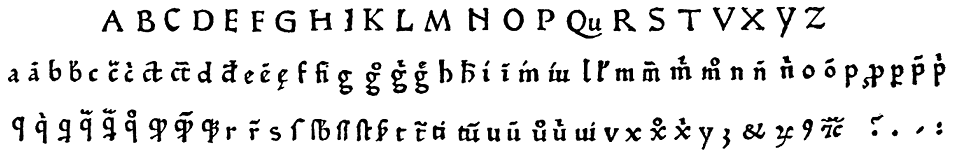
Arnold Pannartz & Conrad Sweynheym first attempt at a roman typeface.
In 1465 Sweynheym and Pannarz were asked to design the types which would be a clear step away from the Gothic style and instead move towards the Roman style. The mission’s had a different original purpose which was to re-publish classics. This had set the duo’s sights on some lost Roman classics. These books were, against Sweynheym’s and Pannarz’s knowledge, actually written in the ninth century with the Carolingian minuscule. Through combining capitals from ancient inscriptions with the letterforms drawn from the Carolingian minuscule, Sweynheym and Pannarz produced a ‘double alphabet’ that came to be the basis for the Roman prototype, which they later developed in Rome.
This is an interesting artefact due to how this moment marks the first steps in the division between northern and southern Europe’s development of typography. This is the beginning of Roman type as norm in the Western world and it is originally constructed from the intended classical ideals. But this also means that (in exaggerated words) that our typographic tradition is to a large extent built on an unintentional anachronism.
There is a lot to unpack in this artefact and I believe it will be one of my more extensive explorations.
The printed book in 15th century southern Europe
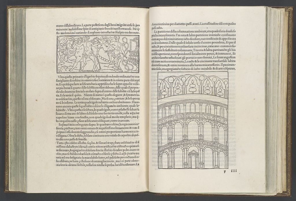
The materiality and ideology of western reading and writing cultures were at this time to a large extent embedded in the printed book. The early printed book was a sign carrier that dictated the truth on knowledge. Print turned the codex into a dominant form in terms of organizing knowledge and memory.
I wonder if I should find a specific book to represent what I will look at or if it should be as broad as ‘the book’, perhaps limit the time frame. I do not want to include incunables due to their strong visible relation to manuscripts. But rather look at the book in Spain and Italy and possibly with connection to Renaissance Humanism and the ideals that followed and was materially manifested.
Grids
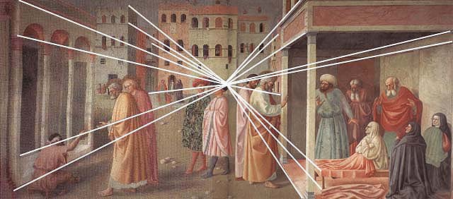
Perhaps a bit too far fetched, but looking at grids or rather the invention of perspective during the renaissance. Perspectives made possible visualisations that were ‘true’, more objective than before. And the objective was more worth. This strongly relates to grids during the modernist era in Switzerland for examplee and how objective minimalist design has ruled graphic design discourse due to its high ‘moral standard’ of being ‘objective’. The ‘rationalisation of space’. Perspective enabled the visual world to enter a more ordered system.
Maps
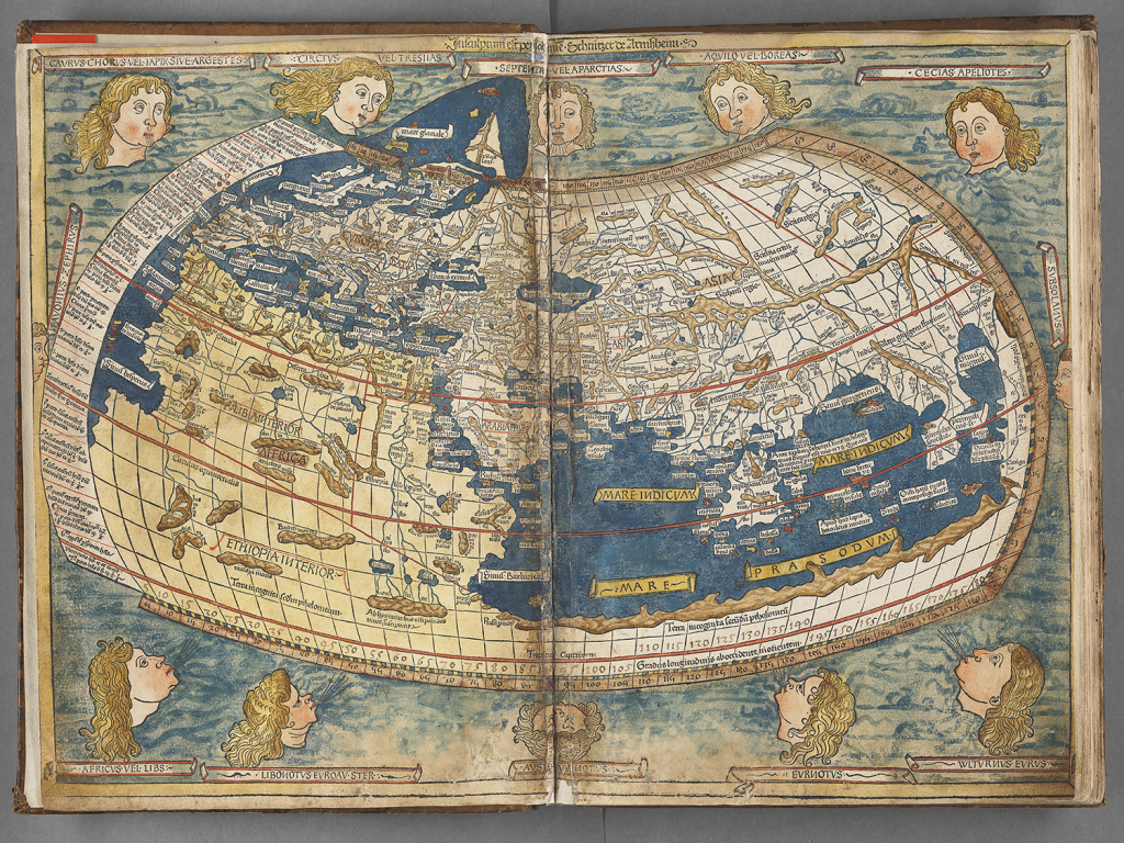
Maps should be a given in this project, yet I feel that is a bit… obvious? Johanna Drucker has a great section on the ideological values of graphic conventions in maps. Maybe there is an example, an artefact, that is less obvious and more normalised that positions Europe as the absolute center.
Formats
Standardisation in format that derives from the 15th century, folio (see page 313 in Houston’s The Book). Maybe I can look into the golden ratio and see if I can adapt formats to that?
Reflection
I was thinking about how to present these artefacts in the best way possible, it is important for me to not simplify complex historical events. At the same time, it has to be simplified. How can I open up these complex strains of history and make them logical?
I was also thinking about the context of this bundle. How do I package the outcome? I have been considering ephemera as that is a bit more understudied since ephemera has historically been transient simple things used by the people. But what could ephemera have been in the early modern age? Working under the notion that I am making an archive of early modern visual language contextualised as ephemera has a slight sense of irony in it that I really like.
Should my outcome create a sense of uniformity? To strengthen the organised perception, and lens. I think the design choices will determine how I do that. I could for example possibly work with an analogous color scale, or even monochrome one. I can interpret the visual artefacts so that they are not represented through images, but in an abstractation.
In terms of artefacts–should they be divided into larger categories, so for example the alphabet, and then I can look at different ways this ‘western lens’ has been enhanced through the development of the alphabet through typography for example.
The book can be another overarching category. And within that category I can look at sizes and convention in layout etc?
This means that it will be smaller bundles in the bundle, or categorised content somehow?
References
MUMBY, Dennis K. 1989. Ideology & the social construction of meaning: A communication perspective. Comm. Quart. 37(4):291–304.
NØRGAARD, Nina. 2009. The Semiotics of Typography in Literary Texts. A Multimodal Approach. Orbis Litterarum, 64: 141-160. https://doi.org/10.1111/j.1600-0730.2008.00949.x
SPITZMÜLLER, Jürgen. 2015. ‘Graphic variation and graphic ideologies: a metapragmatic approach’. In Social Semiotics 25:2 pages 126-141. [Available at: https://www.tandfonline.com/doi/full/10.1080/10350330.2015.1010323]
VAN LEEUWEN, Theo. 2005. ‘Typographic Meaning’. Visual Communication. Volume 4 Issue 2, page(s): 137-143. Available at: https://journals.sagepub.com/doi/10.1177/1470357205053749