Reflection on lectures
In the lecture Susanna Edwards and Sam Winston discuss how modern questions in society can be represented with a design solution. They exemplify this with the Solar Annual Report. Which is a good example of using the medium to illuminate a contemporary problem and raise the message by its execution, its form.
Susanna Edwards gave some input on how to take on this week and what it is about: embracing the unknown, personal process and ritual, design as multi sensory experience… and then Sam Winston added “after all of that, don’t worry about it”. Which is how I will try to approach this week? Engaging in everything and in the way Susanna talked about, but also just allow myself to let go at times? Just try, investigate, don’t take it too seriously but have a good week. This week really speaks to me.
Chloe Scheffe
Chloe Scheffe mentioned a few things that stuck with me, first of all she sometimes used the word “activated” which is basically just a term I have not thought of or heard of in relation to graphic design before. I interpreted that as giving a more dynamic or tense dimension to a composition. She talked about handwriting for example as a way to activate a spread, and make the page feel tactile and made. I am gonna steal that term, and use it to widen my vocabulary.
Another thing I thought about was the magazine Lux, the xenofeminist magazine. Chloe said that she used typical female tropes in the design and worked with them, playing with feminine imagery and making it strange. As well she mentioned brutalism. It really intrigued me when looking at the overview of the magazines spreads that the pages visual tensity increased over time and got less cohesive, and that she had included “goo”–to make it feel more “alien”. I love that stuff, being able to be so allowing to yourself, taking the matter and the product seriously but maybe not take yourself too seriously and therefor being able to create work with such interesting approaches.
This got me thinking about the Swedish design studio Bastion and in particular when they were working with the Swedish feminist magazine Bang. They then found the design strategies for that magazine in norm critical and feminist theories, resulting in kind of brutalist visualizations. Have I mentioned this before? Perhaps.
https://eyeondesign.aiga.org/how-can-designers-address-power-inequity-start-small-and-focus-on-the-local/
http://www.eyemagazine.com/opinion/article/against-the-flow
Design development
Communicate an emotion you perceive your city or location is about.
Take the word and use an appropriate material, form or medium – 2D, digital, 3D or immersive. You may choose to communicate the word directly or you may choose to create a juxtaposition, if there is a contradiction or tension, eg New York is Tense. Upload your thoughts to the ideas wall, with a link to your blog demonstrating further reflection.
I got carried away (again) and had this idea and got completely obsessed with finishing it and even when I felt while working with it that it would not really work out I just kept on going anyway (why) and when I finally failed I got super irritated. But this was a lot of intense work so it had to at least go in the blog. I wanted to work with two challenges this week, the reason being I wanted to work with the forest as my chosen location. And the forest changes character based on what time of day it is. So I wanted to create two challenges from two binary oppositions of emotions, one for day and night.
Night: Fear
The emotion for night time is based on the fact that I am quite afraid of the dark. But also since I during the last fall spent a few nights reading a famous Reddit thread called “I’m a Search and Rescue Officer for the US Forest Service, I have some stories to tell” and after that I couldn’t set foot in the forest for a couple of weeks. And now, for this challenge and the emotion of fear I wanted to use this thread as a catalyst for my idea. I wanted to take quotes from some of the stories and re-work them into sentences and project them out in the woods at night. I thought this could be a way to include the actual location in the message and enhance the message through the medium.
After a while with this idea I wanted to conceptualise this. So what if there was an app for a forest walk you do at night and when you came upon certain positions in the forest, the stories are activated and lit up by a projector. So in the app, instead of navigating with a map, there is a compass without any point directions (adding to the stress and fear) but with marked out story-locations that are more or less in focus depending on how close they are.
Using focus in the app as a navigator came from reading a passage in Visual Communication »Focus, therefore is not just an optical property of images but a conceptual shift on our part that places us in another spatial relationship with the subject of attention.« (Davis and Hunt 2019:67) They argue that focus is a way to locate in space, if something is near or far for example. I thought that taking away the focus would increase the feeling of being disoriented and the emotion of fear.
As mentioned before, focus is a part of the navigation on the app, whereas whatever dot is in focus is the nearest one. As well that is the only way of navigating, while seeing a useless compass.
Inspiration
I actually included this in the Leviathan as well. Enter The Void by Gaspar Noe about an American drug dealer in Tokyo. The typography echoes the film and location. The clip is set to start at approx 1 min since that is when the true typographic show begins.

Gabor Palotai

Robert Brownjohn, Watching words move
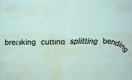
The examples above are ways of deconstructing existing typography to enhance the written message. Simple yet strong examples of visualisation. I decided to use the following sentences from the Reddit-thread and use as a catalyst for my own ones in this challenge “I see something in the distance” — I wrote: “I can see something” and added “RUN”. “It’s almost like a video game glitch, where the house has failed to load completely and the stairs are the only thing visible.”– I wrote “Something is wrong”. If this were to be done for real I would 100% make sure a realistic stair case was projected some time during this walk, as it is an eerie recurring thing in these SAR-stories.
Sketches

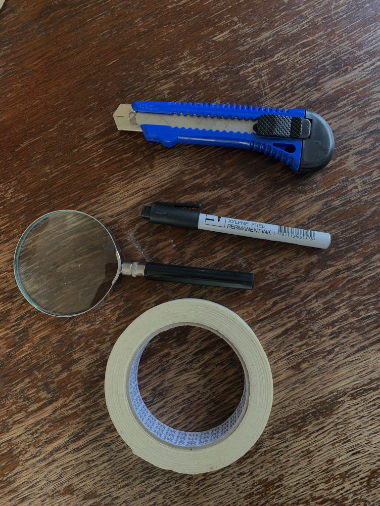
Building my own projector


Final outcome


Day: tranquility
The contrasting emotion I chose for daytime in the forest is tranquility.

Shared some thoughts on possible idea on the ideas wall. My very subjective perception on the forests tranquilness is because it feels like there is a different connection to time. Less stress would be the simple explanation, but I feel like it is more than that.
I have read a passage from Hylland Eriksen on the construction of time. And specially calendars, calendars are an old invention developed independently in more societies than writing(!). (Hylland Eriksen 2014) In those older calendars there are more focus on seasons for example rather than presenting a linear year. Looking at older calendars also let me know that they are often circular.
Then I found something that I think will tie this time-thing together with my thought of the forest, tranquility and my idea that I then started working on. Henri Bergson has written an essay called “Time and free will” in which he criticizes time that regulates us from the outside, instead of letting the tasks at hand fill the time from within. So this got me thinking about an old Swedish Farmers Almack which is basically a seasonal calendar built on old superstition. Perfect. I took those superstitions, put them in chronological order and did a circular calendar.
If I had more time I would have done them in timelines since there are a lot of predictions of the kind: if march is dry, then a beautiful spring will follow. So the original idea was to create these timelines were the different predictions come together in a visual metaphor of a trees annual rings, but that was a bit too time consuming for a weekly challenge.


All of my sketches was with the typography horizontal on the annual year rings, but while sketching in the computer I experimented a bit with adjusting the type and got a very striking visual effect that I wanted to go for instead.
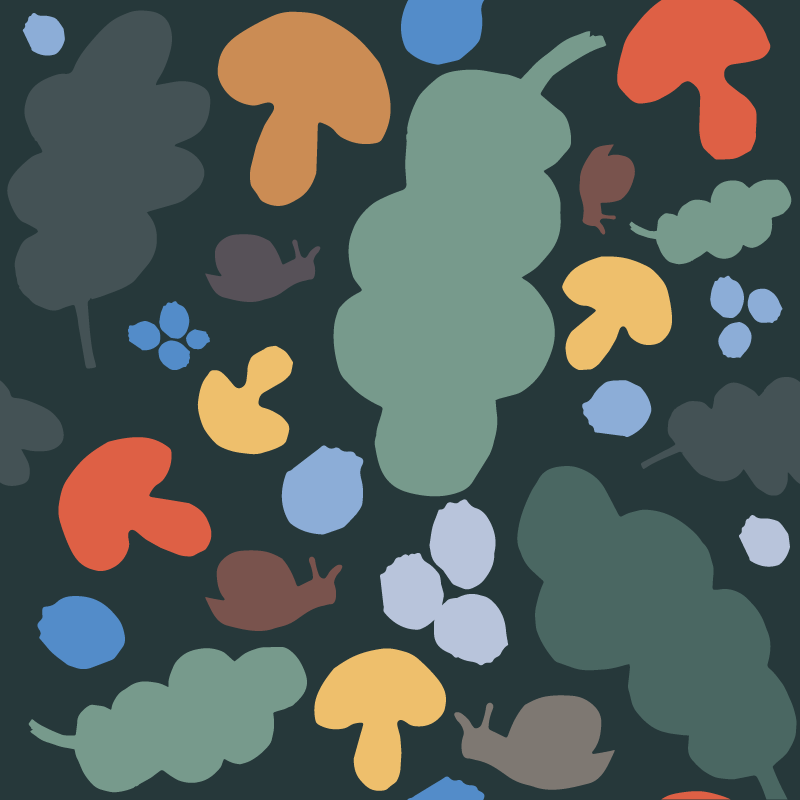
Final outcome

Extra arc, lungs & pattern


Reflections
WHAT have I been doing this week? Just going at things like a juggernaut, not really thinking OR overthinking and just failing, failing failing. Over and over again and then instead of trying to correct it or adjust it just moving on to the next thing. I was so confident going into this week and then…this? I feel like I should not be doing this on a Masters level. At the same time I don’t wan’t to pretend like I am not vulnerable and fail because that has to be included in this “journey” and that is also very much who I am. I am rarely embarrassed of my mistakes, if they’re not hurting anyone other than myself. Hahaha the absolutely most vulnerable thing this week was doing that PROUD slow motion walk with my home made projector and then failing fatally with that part of my challenge. Still love myself for that though. That is very much aligned with how I am as a person. High risk–High reward. Just didn’t pay off this week!
Ideas wall


References
Bondepraktika (Farmers Almanack) http://www.ewiklund.com/bonde.htm
Eriksen, Thomas Hylland, 2014. Globalization: The Key Concepts. Berg Publisher.
Davis, Meredith and Hunt, Jamer. 2017. Visual communication design : an introduction to design concepts in everyday experience. New York: Bloomsbury Visual Arts.