Reflections on lecture
I wanted to address something from this week’s lecture, as I know this was also mentioned by Mirko Borsche, when he spoke of his professor who gave him a hard time for using blackletter (it felt like perhaps that was just an evil power play by his professor on false grounds 🙁 I’m coming for you now, professor)
In the lecture it is said that: “For example, something like the black letter, which for a lot of weird reasons has been so connected to, for example, the National Socialist Movement in Germany. That is a connotation that I couldn’t necessarily tell you why it’s there, but I could tell you it’s quite important to know about it so that you know what you’re doing if you ever work with that kind of letter.“
Personally being quite fond of typographic history I found this to be a bit of a strange remark. There are no “weird reasons” why Blackletter has been connected to the National Socialist Movement in Germany, they are actually quite straight forward. Part of the reason is–if we just look back at the lecture, Gutenberg’s bible was printed in Germany. And this bible of Gutenberg was printed with a gothic style: a Textura, since the incunables usually mimicked handwritten manuscripts in style (Werner 2019). The Gothic style was more common north of the Alps at this time. (Ridderstad 1986) So there was a solid tradition of using gothic style in this region for a long time, in Germany the Fraktur and Schwabacher was used in vernacular texts until the 20th century. (Raven and Proot 2020) Then the Nazis used the Fraktur for their material, but banned it in the early 40s because of a reputation of it being of jewish origin. (Falk 1989) So that is one of the possible connotations of blackletter. Also simplified, history is and has to be complex, this was at least an extract that felt blog appropriate.
I personally really like these letterforms, since they are the echo of manuscript tradition and a part of early writing in the west. I think that is also why I bother writing this *essay* as it is often clouded with a lot of misinformation.
In regards of the Gutenberg bible I also reacted to its introduction: “the idea of movable blocks, movable printing blocks, was not first thought up by Johannes Gutenberg, but for the sake of our argument in the west, or regarding the Latin alphabet, we can say he invented the idea of movable type.“
A very strange thing to say? And… also wrong? Why disregard the complexity of a historic event just because you either can’t comprehend it yourself or struggle to communicate it? Forgive me for being salty, but this is accessible information, so why not find that instead of brushing it off like this?
A factual error from the lecture is the statement that the printer is using ”boxing gloves” to distribute the type. The printer would at that stage already have meticulously placed the type and it would sit firmly in the forme. The ”gloves” are really a cushion-like tool, called ink balls, to make sure the ink is distributed evenly over the type. (Werner 2019) Like this:
Romain Du Roi, what is interesting with this is that it is such a product of its time. The Enlightenment and the gaze towards ”scientific” methods that now had trickled down to type design. I love that the societal complexities and changes can be visible in the detail of letterforms. FYI: There is this myth that the Swedish Court wanted this Typeface as well, but that Louis XIV Said no.
Ideas wall reflection


Learned something new this week thanks to Abbi’s challenge! She had chosen a part of the Divine Comedy, namely Dante’s inferno. And even if she actually wrote in that post that Dante Alighieri is considered the father of the Italian language I got perplexed seeing it written in Italian considering this being written in the early 14th century in Italy I would take for granted it was being written in Latin. But apparently then this is one of the first written pieces in Italian! How did I not know this? How intriguing and what a lovely starting point for me to approach my old books in the weekend.
Design development
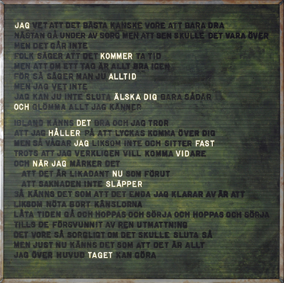
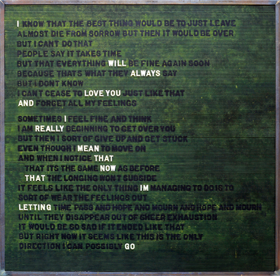
For this weeks challenge I was choosing between Karin Boye’s “I mörkret/In the Dark” or Johan Thurfjell’s “Utan titel/Untitled”. I went for Johan Thurfjell as I own that myself, it is hanging on the wall and when I bought it I felt a lot for it. Now perhaps 15 years later I still like it and thought it could be a nice thing to interpret myself.

Inspiration
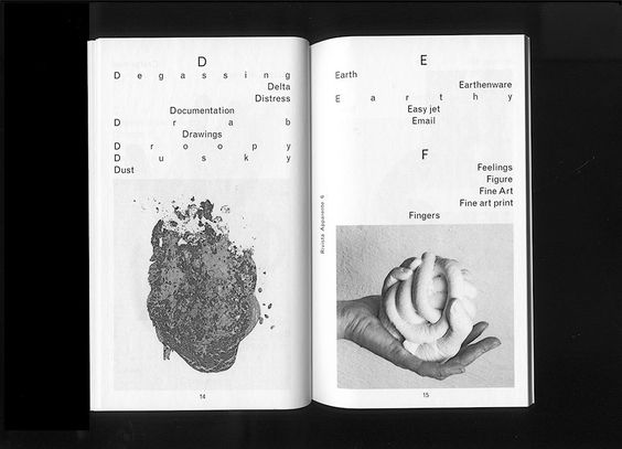
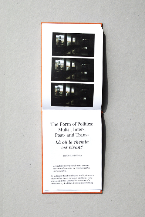
A challenge was to take a real step from this piece of text, to translate and communicate it into a new typographic form as it is already in a strong visualization of typography. Inspiration from sources and expressions far from the original one helped finding a new appearance.



My interpretation of this poem is that feeling you have when your world is falling apart, but you are trying so hard to keep it together. And then someone lays their hand on your shoulder and ask how you are and everything comes out at once. A hectic ramble where your voice breaks and throat hurts and then tears and incoherent words.


Inspired by Chloe Scheffe’s lecture and how she let her material go sometimes I wanted to let these words slowly starting to disintegrate like a cracking voice. I was also inspired by her typography where she had copied it a few times to get some rougher edges, and wanted to try that. So cutting & gluing was my approach to this.

I felt early on that I wanted to use pink and black. And tried printing on pink paper. Shout out to my printer still holding on, producing quite ok things after all of these years.

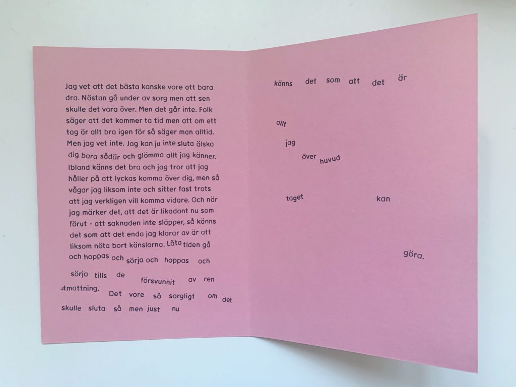
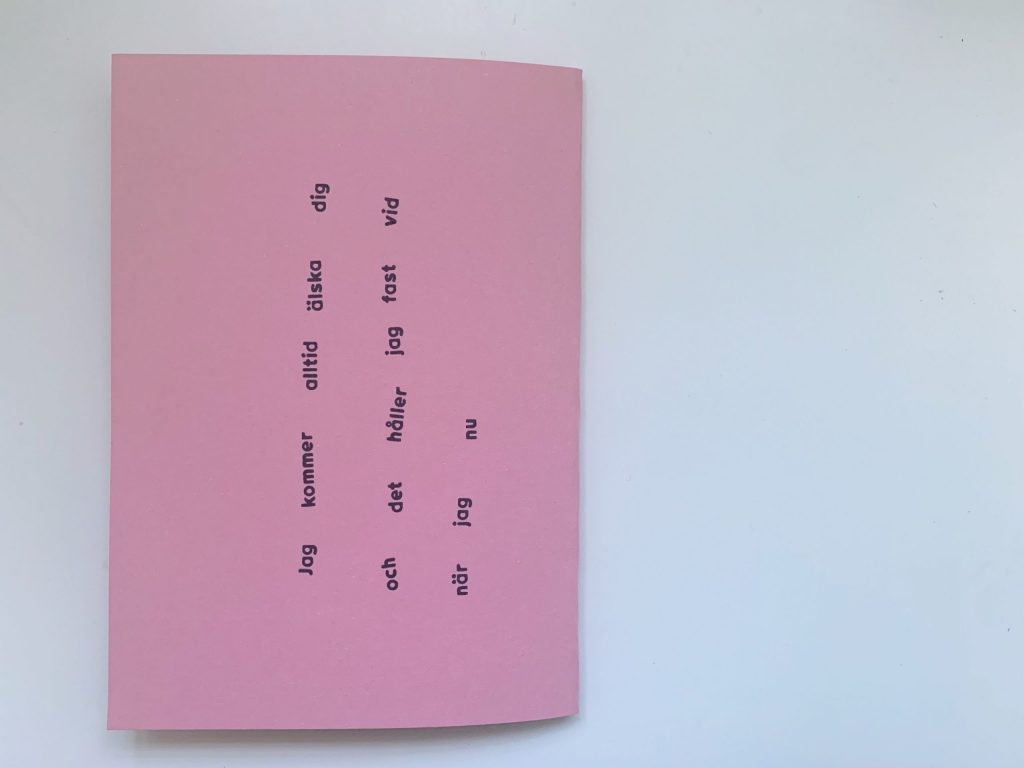
The thing with this piece is that there is like a second message within the longer text. The longer text feels like someone just speaking without thinking, just feeling. And the text in white on the original is the absolute heartbreaking sentence “I will always love you and I really mean that now that Im letting go” but the thing is… this sentence is a bit sadder in Swedish. I don’t know what it is but the text overall and that highlighted sentence is a bit more desperate in Swedish. The translation is not really aligning with the “word play” as in that integrated sentence says more “I will always love you and I am holding on to that as I am now letting go”. Maybe this feeling is also because Swedish is my first language. I wanted to do this in Swedish as I feel it looses some of its pain when translated.


Some feedback from the Ideas Wall that was very valuable. This feedback established that the cover should be black. And that the type on that should be pink. Further on the cover should perhaps have some sort of texture to avoid that harsh contrast. On suggestions from Stuart I had a look at Göteborgstryckeriet. Looking at that inspiration I realised that if this were to go to print I would want it to be uncoated paper from Munken, maybe Polar like Artilleriet in this production printed with their hybrid offset technique. It gives a matte not to textured expression.
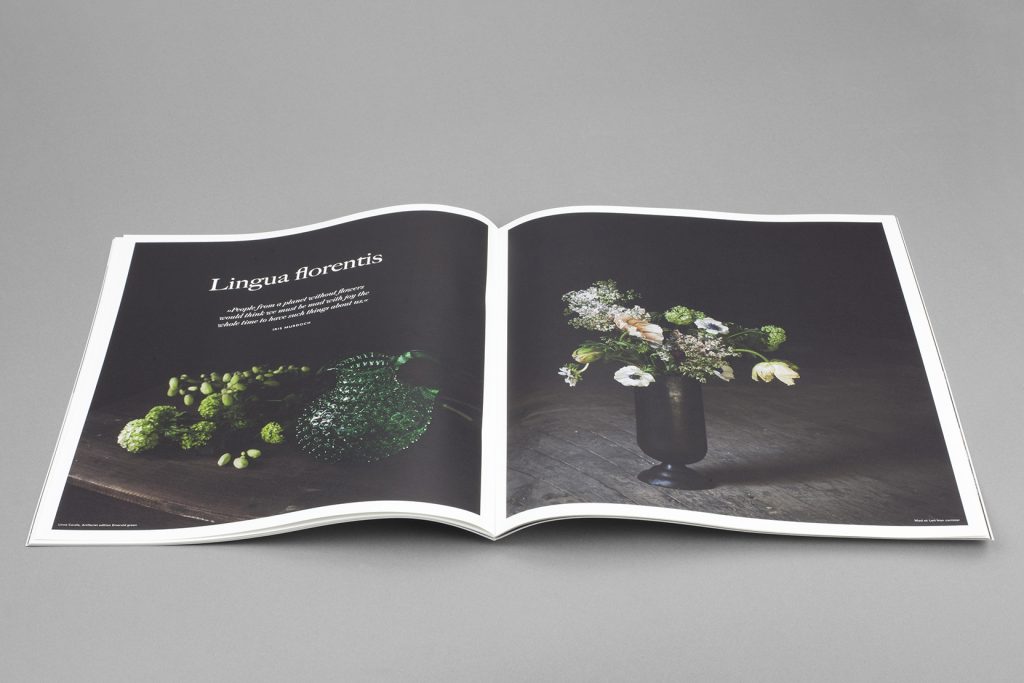
I was also thinking that the tension of the words falling apart could be enhanced with some structure in the composition. Therefore I wanted to work with solid margins, and choose the method of J.A Van De Graaf to establish them. It is a Medieval method for page construction, common in Incunables. This way I have a little hint of the good old Middle ages in this challenge too.


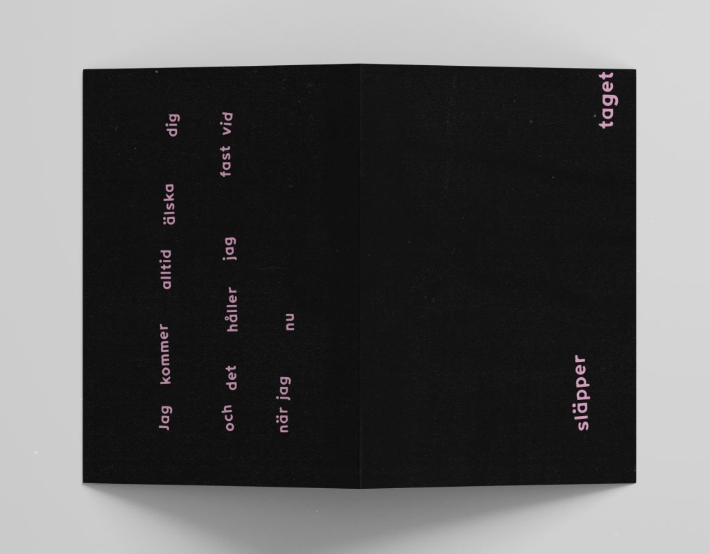
The pink ripped edge on the cover had to go, I think I held on to that as it underlined the texture of the paper. But It stole attention that it was not supposed to get. As well after finishing the folder I realised the first piece of the text on the cover was to messy to create that contrast I wanted to get so I had to adjust that as well for the final outcome.
Final outcome
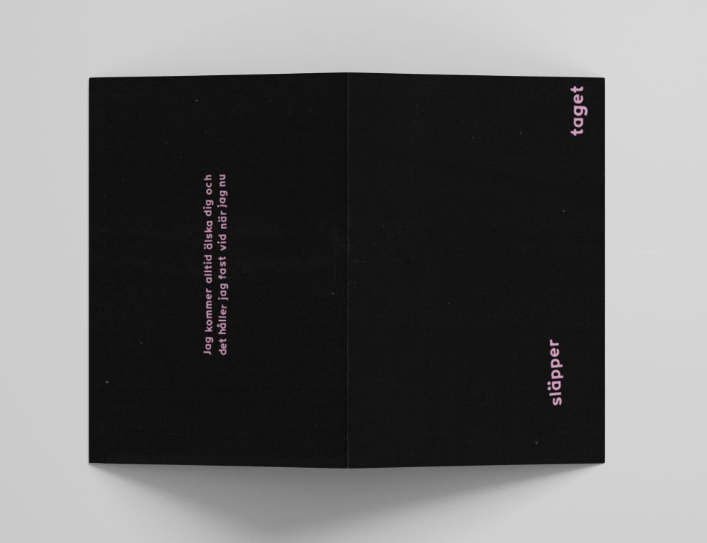

The front page says släpper taget/letting go, and is turned on the side, the reason for this is that I wanted it to be a hick-up of sorts, but also something to discover perhaps not at once, that if you fold out the cover it is a composition in itself. Chloe Scheffe said something about this, that when working with covers, the front and back can be a dialogue and I think that is a very beautiful way of looking at a cover. The type on the right front page is visually depicting what is happening: one person letting go of the other… Im not crying–you are.
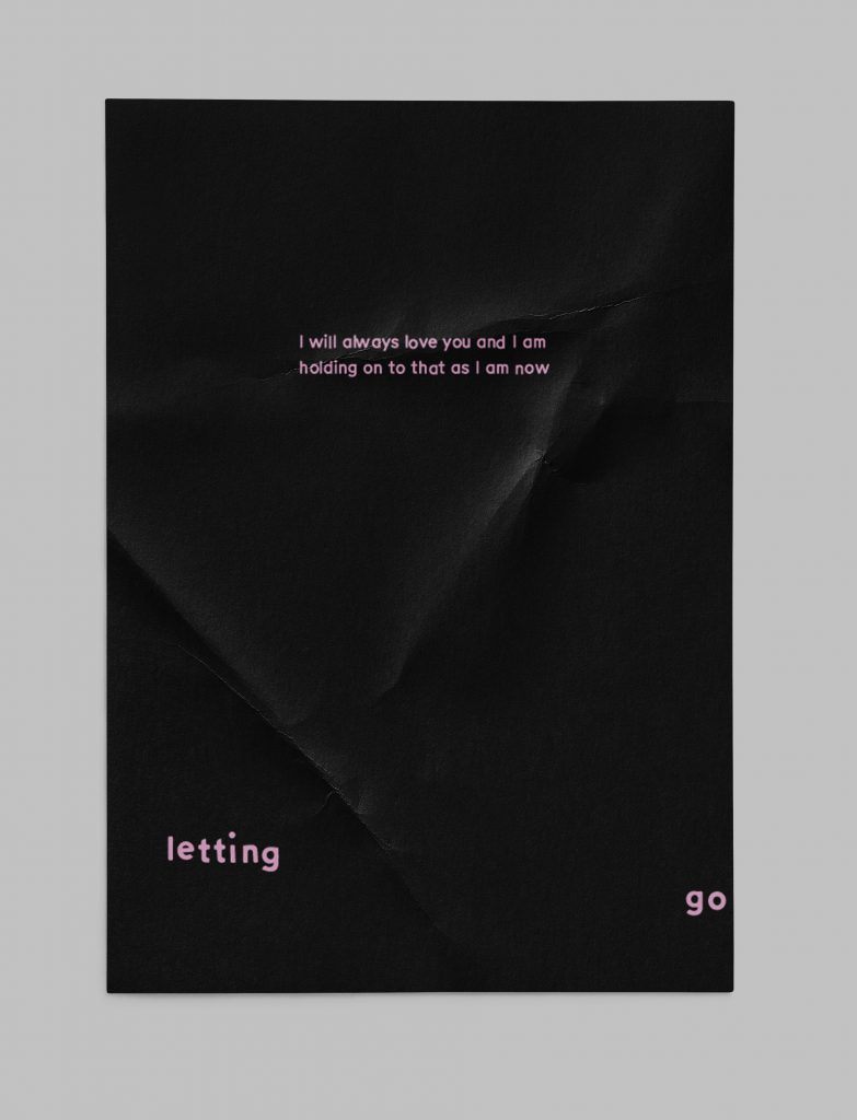
Being a bit bothered about the English translation, as well partaking in a class with the majority having English as their first language I thought it would be a nice thing making a poster of the quote with the translation I found more fair to the meaning of the text. Maybe put it in an Espressobar?
Reflection
The past weeks I have been working so much with analogue techniques in my processes. Days of constructing these analoge expressions and then days to translate them into the digital world. But this time I actually felt it was worth it. I wanted to approach this weeks challenge a bit more calm and collected considering last weeks tornado-approach. As well I was really inspired by Chloe Scheffe, both her ways of talking about and working with projects.
Creating some proper margins using the J.A Van De Graaf methods and then setting the typography in that, to also let it break from that same compositional convention gave the desired tension to this piece of text. For the cover, which is almost its own piece the strength of “letting go” was enhanced by the sentence preceding it being quite tightly set. The typography keeping in line so to speak is surrounded with quite generous white space, margins while the typography that is breaking up the words is also breaking the expected composition.
I was very grateful for the feedback from the ideas wall this week as it really leveled up my outcome. It also gave me the energy to keep going and do that final adjustment on the text of the back cover. I was so close to just leaving that (lazy) but being so satisfied with the rest of the folder it had to be done, and guess what: 1000% worth it. Stuart’s input on researching some printing techniques also made me realise that in some project it might be interesting to even start in that end? Investigating printing and materials and use either as a limitation or catalyst for the project?
I hope Johan Thurfjell healed from his heartbreak <3
References
Werner, Sarah. 2019. Studying early printed books, 1450‒1800: A practical guide. Hoboken & Chichester: Wiley Blackwell.
Ridderstad, Per S. 1986. Den grafiska tekniken under 500 år. In: Landqvist, Marianne (ed.). Det tryckta ordet. Stockholm: LT förlag & Sveriges tekniska museum, 5-31.
Raven, James & Goran Proot. Renaissance and reformation. In: Raven, James (ed) The Oxford illustrated history of the book. Oxford: Oxford University Press, 2020, 137-168.
Falk, Valter. 1989. Bokstavsformer och typsnitt genom tiderna. Stockholm: Ordfronts förlag.