Research
To be able to better understand my findings I had to look into Swedish typographic history. Swedish book printers were dependent on German typefaces for quite a long time. It was the Germans who ran the first printing places in Sweden and the first printed book in Sweden was also printed by a German man: Johann Snell in Gothic style. (Falk 1989)
There was no production of typefaces from Swedes until the middle of the 17th century when Johannes Bureus created a fraktur that was cut for printing by Peter Van Selow (a dutch man who worked in Sweden). Bureus fraktur was called a “Kurrentfraktur” and it was used in Sweden from the 1640s and forward. (Falk 1989)
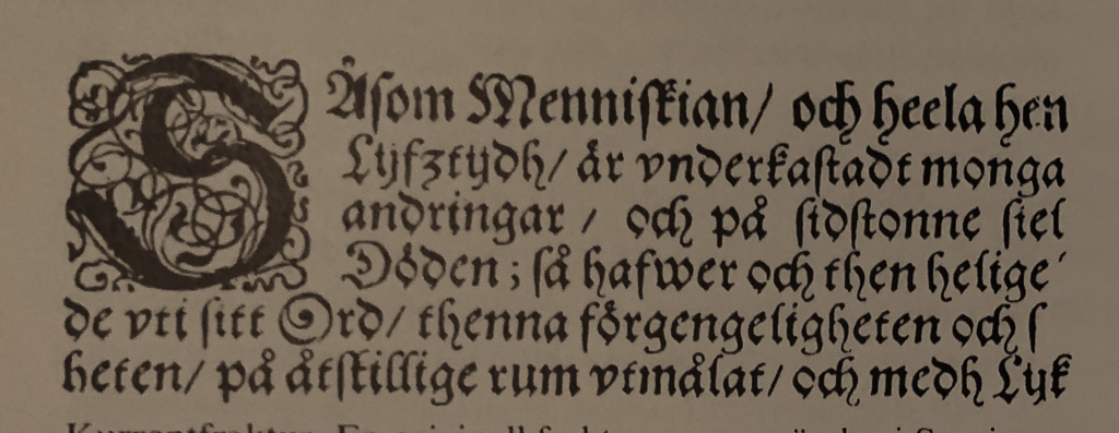
A German printer, Ignazius Meurer, who was working in Sweden, had set a book on Swedish law in a roman typeface in 1628 but the clients were not satisfied as they thought the roman typeface was not authoritarian enough. Therefore he had to use a Fraktur typeface for the next edition. Gothic typefaces were used for all prints in vernacular language in Sweden until the middle of the 18th century. Because of the Fraktur’s dominance at this time, it was called “Swedish style”. It was regarded patriotic and protestant by its advocates, while roman typefaces were considered foreign, catholic and hard to read (Lundblad 2019).
The roman typefaces were put away for around another 100 years in Sweden (Berndal 1990). It was not until the 1820’s that the roman typefaces dominated over the Fraktur typefaces in Swedish book printing. (Ridderstad 1996)
It would take until 1951 before Sweden got the first typeface that was drawn for the Swedish language and the Swedish bouma. That typeface was Berling Antikva by Karl-Erik Forsberg. (Falk 1989)
To reflect on that short introduction to Sweden’s typographic history, it says to me that Sweden’s typographic identity is not perhaps as original as for example England’s or Germany’s. Being so strongly influenced by Germany’s tradition kept the gothic style dominant for a long time in Sweden. What long term effects can this have had on Sweden’s typographic culture?
An anecdote on when Sweden’s most solid typeface got the whole country shivering
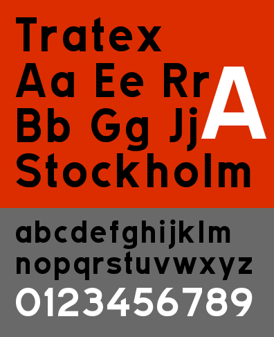
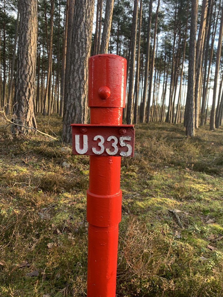
Every Swedish road sign is set in Tratex, a geometrical sans serif originally drawn by two engineers: Carl-Gustav Gustafsson and Chester Bernsten. They drove around in a car for days and nights making research on the typeface they constructed. “It is not only about the typeface, but also about how to furnish the text or indications in relationship to each other” Says Chester Bernsten. (https://sverigesradio.se/avsnitt/335237) .
There is an interesting story about this typeface. In Sweden, the typeface Tratex and the road signs has an authoritarian character, as a sort of objective truth-teller. Maybe it is necessary to mention that Sweden did, and to some extent still does, put a lot of faith in the authority.
In 2004, in Linköping, Sweden, an art exhibition was opened. On the main square in the city the artists in FA+ put up road signs, set in Tratex with quotes from Swedish writer Lars Norén’s play “War”. Quotes about death and despair from a dark reality far away, unrelated to us and our safe lives in Sweden. However, at that same time a double murder happened in that very same city and Sweden’s second biggest murder investigation in history started.
The signs from this exhibition got accused for having played a driving factor in this murder. (https://www.aftonbladet.se/nyheter/a/6n926e/noren-skyltar-vackte-obehag) This accusation changed the perception of the message on these signs, and brought that darkness to Linköping. These signs were removed and later banned from several other cities where they were planned to be exhibited.
The functional typeface representing a good common authority really had an involuntarily change of character due to a contextual shift. These signs and this typeface is something the common Swede blindly follows. Using them for disturbing messages such as “lets kill them all” was an intense change in perception, especially when adding that horrible double murder to this equation. Personally I think this is an interesting possibility to study contexts and sociopolitical commentary. How would the signs have been perceived if that double murder was not committed that day?
Munken Sans
When trying to find a direction in Swedish identity in terms of typography, I think of the recent typeface Munken Sans which is inspired by Tratex. Giving a sublime echo of Swedish functionalism and to some extent Folkhemmet.
In this video from Munken, there is an overview of the letterforms and some words. One of them being “Mill community”, as mentioned by Baines (2008), the choice of words can introduce a narrative element. It is the tacit knowledge about the cultural context of these small mill communities that makes very much sense for me as a Swede when seeing these letterforms and especially forming the words about this Sweden that they connote.
Workshop challenge
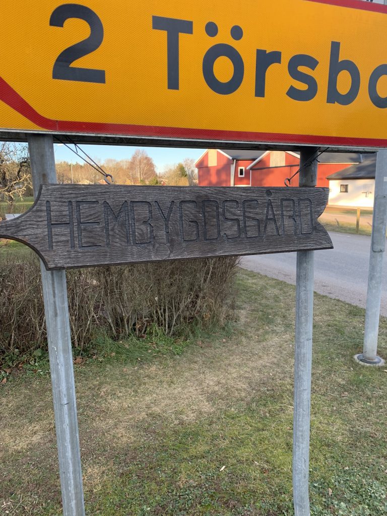
My locality is in a small village of 400 people, at the center of this village is a small school and an old rustic community center, and just behind it all–like a massive coulisse is the forest, surrounding the village.
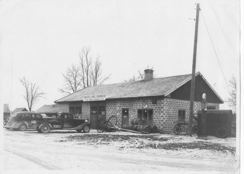
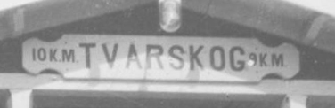
At first I was hesitant on how to approach this challenge, should I find typography that could represent the province of Småland and find a focus in the handicraft and glass industry this larger area is known for, or should I focus on the sort of capital city of Småland: Kalmar? Or should I focus on the small village where I live, Tvärskog, and look at the surrounding parish. Can I find something that can be representational not only for Tvärskog but for all of these small, seemingly insignificant villages of Småland? Villages where the majority of the population has been and some extent still is reliant on one local industry. In Tvärskog that is the saw mill.
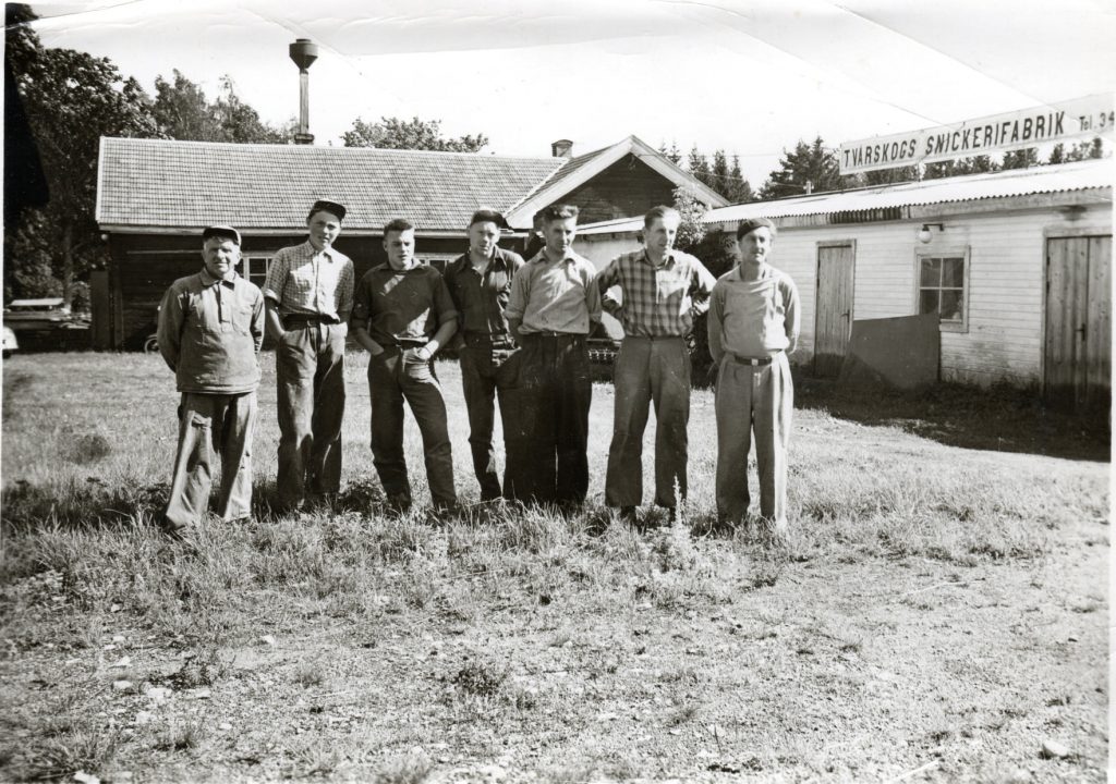
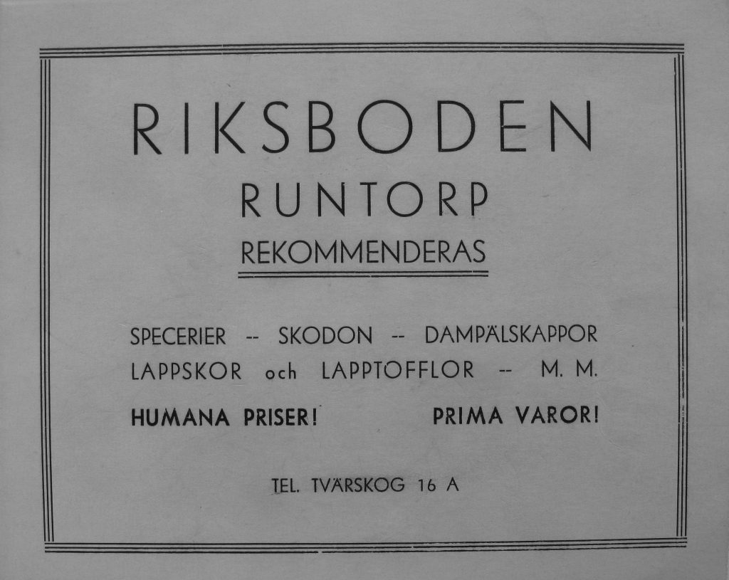
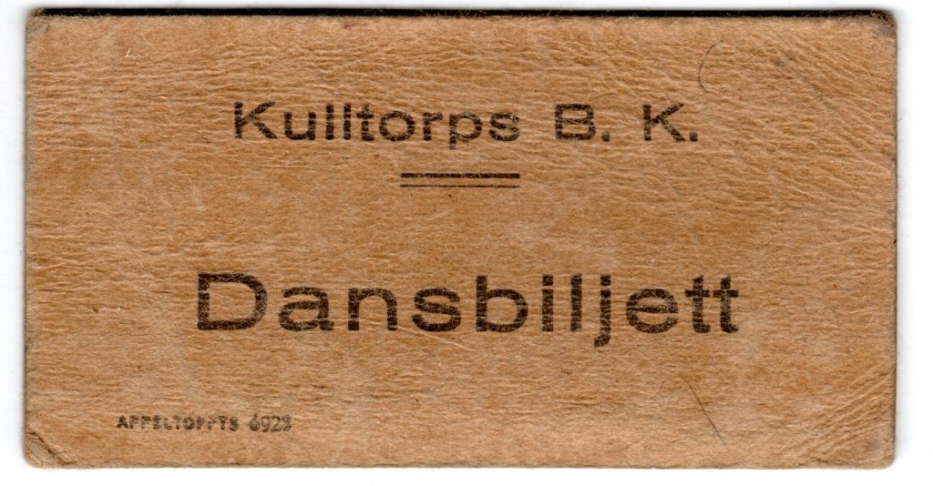
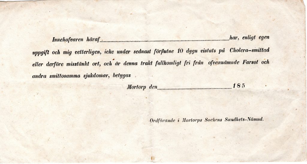
During GDE710 I made an acquaintance with an older man who lives here who collects photos and material from the village and surrounding parish. He comes from Tvärskog and share stories and pictures in the local facebook group. For this challenge I reconnected with him and he came by with some pictures as seen below.
Historical typography
Typography on buildings

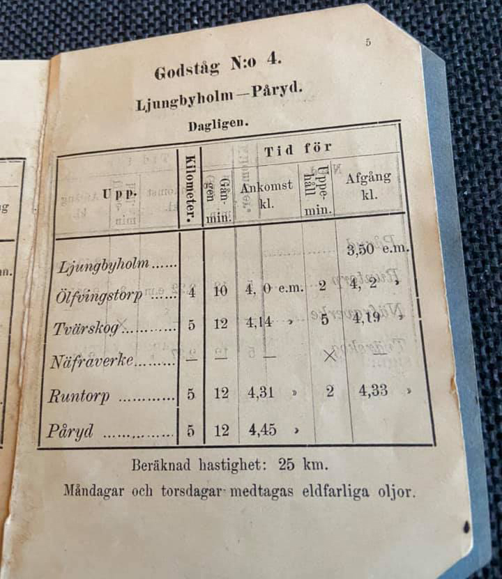
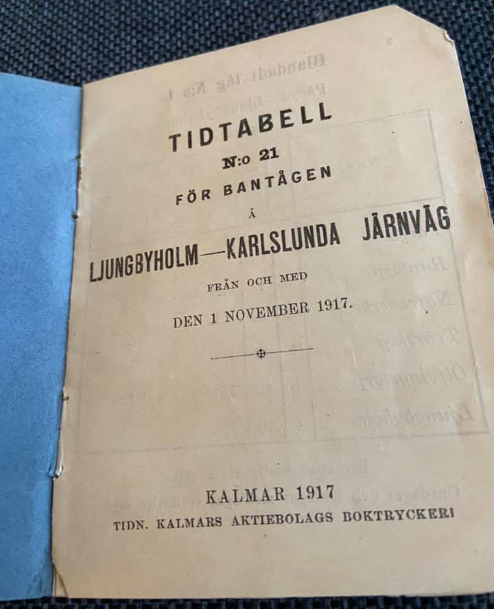
Text directly translated from Björn Jaensson: The railway “Ljungbyholm -Påryd” was inaugurated in 1908. It was the start of the emergence of the “new Tvärskog”. Tvärskog was previously a number of houses in the southern part of the community. The first station manager was Karl Lindåberg, who was the manager until his death in 1936. The station became a central place where, in addition to buying a ticket, they also picked up the mail that came with the train. If you needed medicine, you placed an order at the station which sent it on in the “medicine box” to the pharmacy Lejonet in Kalmar. The medicine was then sent back in the same box and could be picked up at the station.
Typography on ephemera


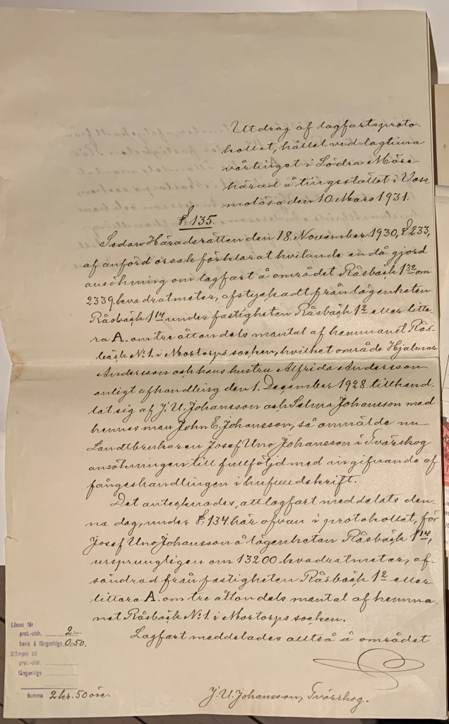
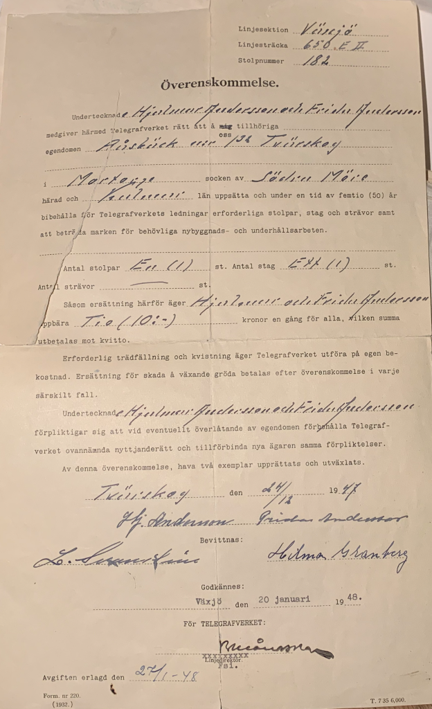
Typography on formal documents

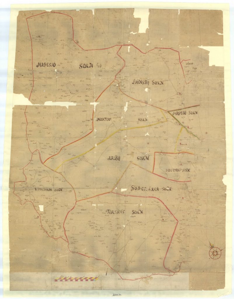
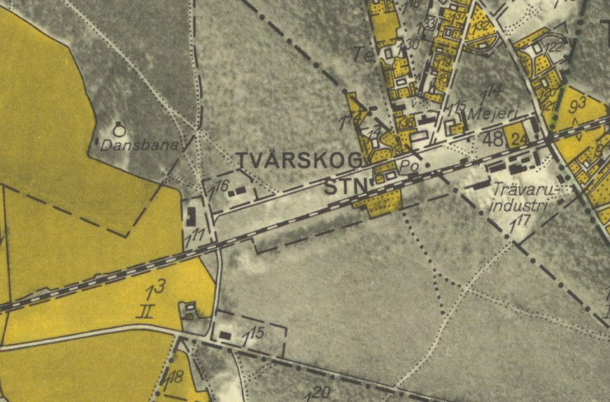
Typography on maps
Contemporary / found typography


Reflection
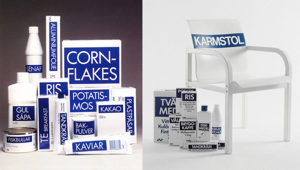
There is a balance between the functional sans serifs and the hand drawn letterforms in Tvärskog. I get the impression that it is either authoritarian letterforms or home made ones competing for attention. But “attention” is another reflection I would like to include here, I was recently in a discussion about Sweden’s diversity in terms of visual communication. When I grew up there was really a limited number of choices you could make about anything. Food, clothes, furniture, etc and not much advertising compared to many other countries. There was even a brand that was created in an ambition to be unbranded.
For me, personally, this is indicative of a country that has had a strong state, and I can also perceive that old way of habit as quite present where I live. In GDE710 I did a folder where I looked at the growth of a right wing xenophobic party in Tvärskog the past 10 years. A party that ideologically dwells on the past, longing of an idea of Sweden as it was back in the days. The second and third largest parties out here are also quite representative of a Sweden that was, but with more humane ideologies. Walking around Tvärskog this week that very temporal stagnation and the faith in the functional is quite visible. And with functional I don’t mean that someone has tried working out functional typography for the signs in Tvärskog, but rather they just echo the road signs, or find something as simple as possible. No particular thought or idea is put into it, so no decorative expressions are necessary.
Final outcome
Tvärskog is a mill community, a small village centered around a saw mill, it is a typical village for the Province of Småland. A place where most people just pass by. There is something here called the “Tvärskog’s spirit” that is partially based on the people of Tvärskog simply doing the things that need to be done for the community. When the municipality wanted to move the school, because it was too small–the people of Tvärskog built a bigger one. Every year a group make sure there is ice in the rink. This is a lovely thing, but it is a mentality that contains multitudes, sometimes there is a bitterness towards the municipality and the outside world. Sometimes there is a lovely sense of community, where the wellbeing of the people here comes first.
The way of communication is different than perhaps in a city. If I need wood, I just call Ronny down in Mortorp, he will get it ready in 15 minutes. If there is any trouble with the house or in the garden, usually the neighbor comes by automatically. Him and his wife will suddenly be standing there, ready to help. Saying hello and talking to each other over hedges, discussing good spots for finding chanterelles or blueberries. I think this way of communicating is the reason not much typography can be found here as it is a redundant way of communicating. It is either mind your own, or talk to someone and they will help. It took so long for me to understand and navigate these implicit ways of finding out stuff in this community. The amount of typography in Tvärskog is very limited, but the examples found do give a good implication of this very identity, way of being and communicating.
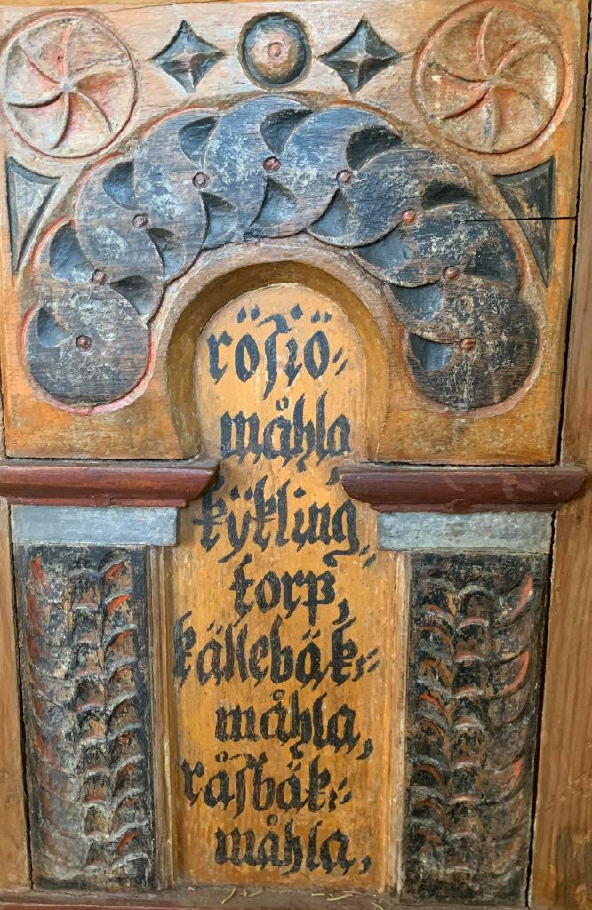
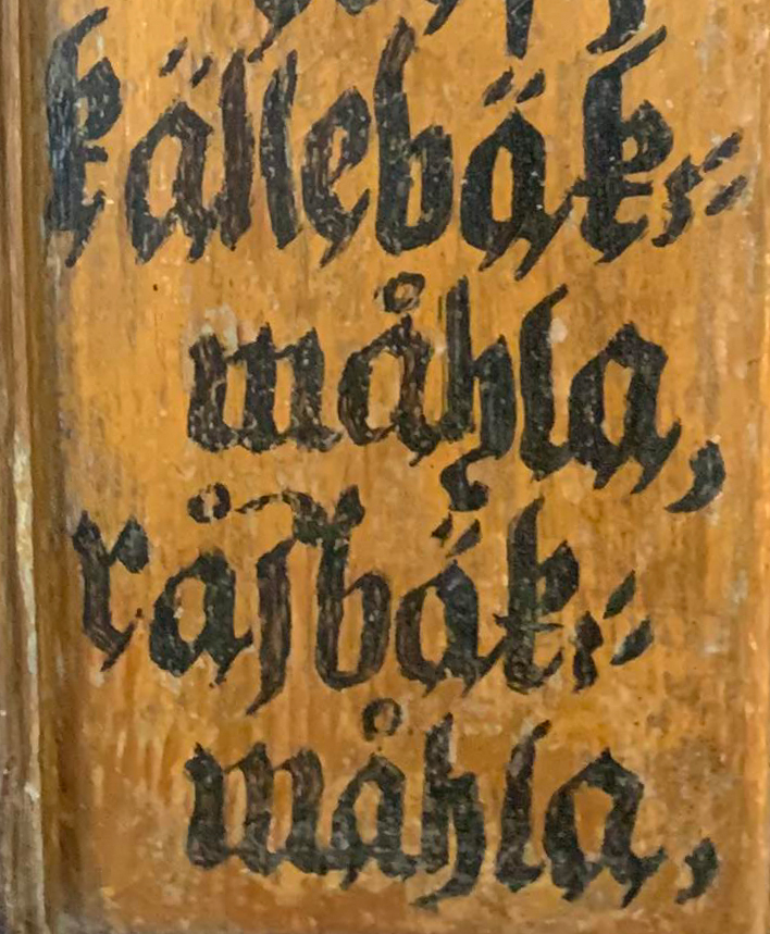
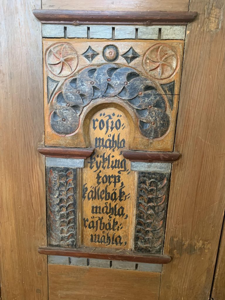
Hand drawn gothic style in the local church. This is a beautiful representation of Sweden’s earlier hand written letterforms. A gothic style presumed to be from early or mid 17th century by Anders Målare from Rasbäcksmåla who is also buried in this church. The Swedish National Heritage Board has a building register and in one of their reports on Mortorp’s church, Anders Målare being the creator of these letterforms is discussed as possible and might explain how he obtained such a good burial ground–inside the church. These letterforms signify the locality from two aspects, the use of gothic style as a dominating form in Sweden and the handicraft that is very much representational for these small provincial villages in Småland.
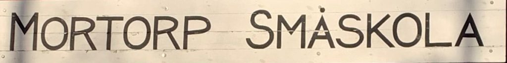
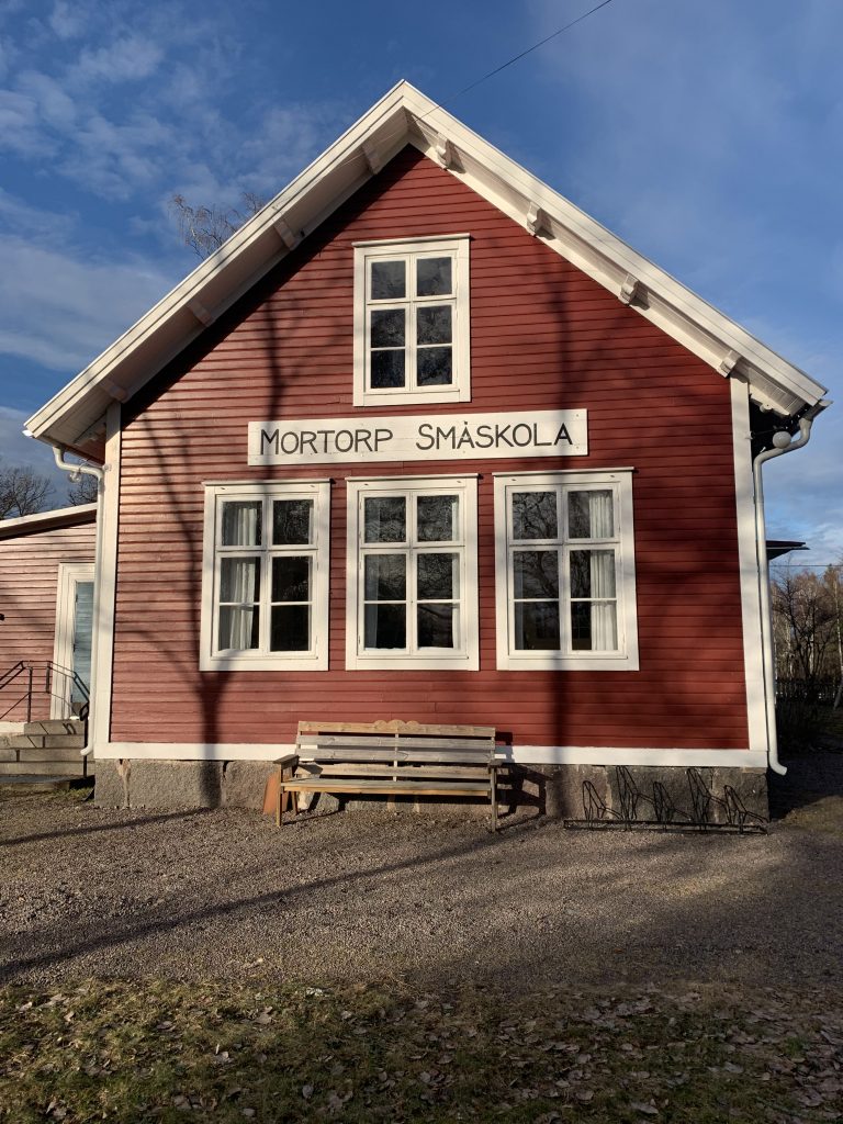
Mortorp Småskola. The text here says “Mortorp’s small school”. (Mortorp is an even smaller village than Tvärskog, but the parish in which Tvärskog is included is also called Mortorp).
Despite it being hand drawn it has a very specific character with repetitive letterforms. Some of the letterforms echo a geometric sans serif, for example the A’s and M’s. While the R and P has a convincing air of Jugend (Art Nouveau). And then the human hand has taken its own artistic freedom on the rest of the letterforms. This sign sublimely signifies what differs Mortorp (the village) from Tvärskog, despite being two interlaced villages in the same parish. Mortorp is much more artistic, less focus on the functional and more focus on the farming and experience of the good life. Sounds made up but to exemplify: the chairman in Tvärskogs rural association is an engineer and inventor, while the front figure in Mortorp’s rural association is a well-known prog musician. It sets the tone.
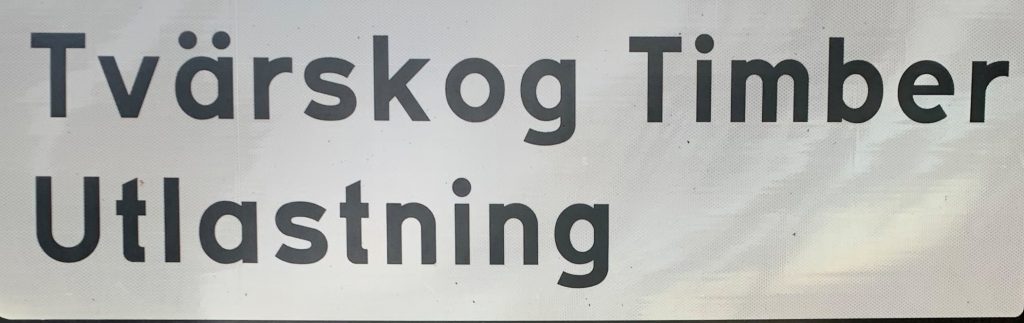
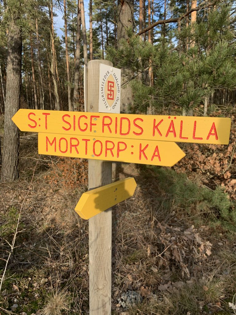
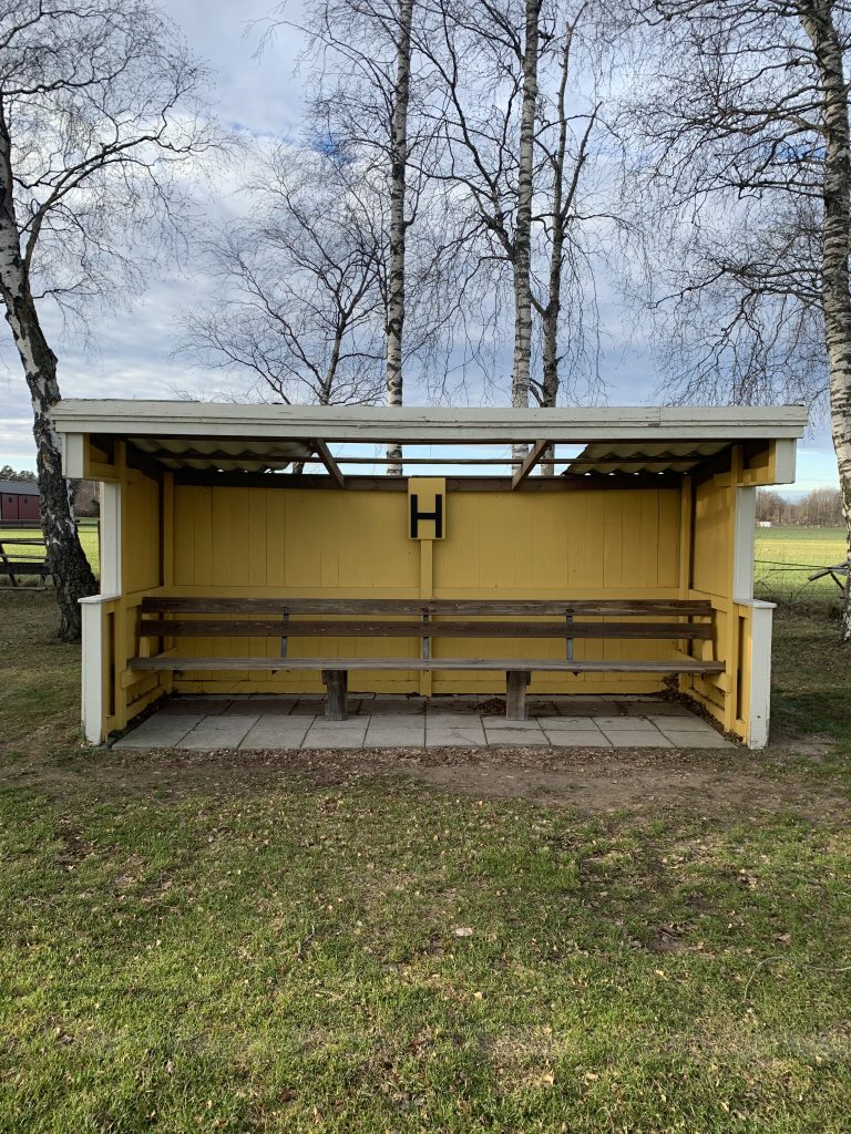
Tratex is an appropriate signifier for the contemporary sense of place that is Tvärskog, partially because of the simple functionality, but also because of the traffic. The saw mill’s log transport and other heavy traffic passes here, as there is a large shaft deeper in the forest. This place relies on the roads for transport of the goods produced here, the road signs and Tratex serve as a small cog in the wheel for that. Tratex is at the core of Swedish mentality because of its functionality and legibility, a typeface streamlined for its purpose–to visualise a set of rules and how to navigate them, for the law-abiding Swede.
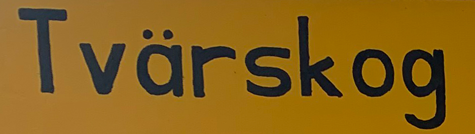
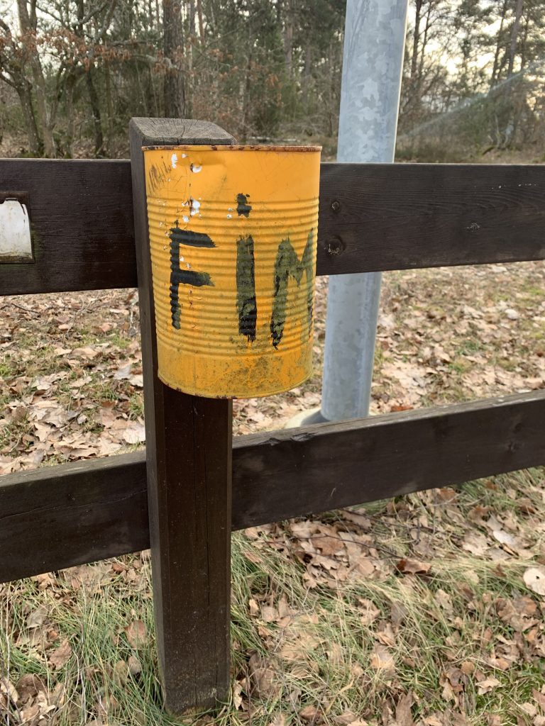
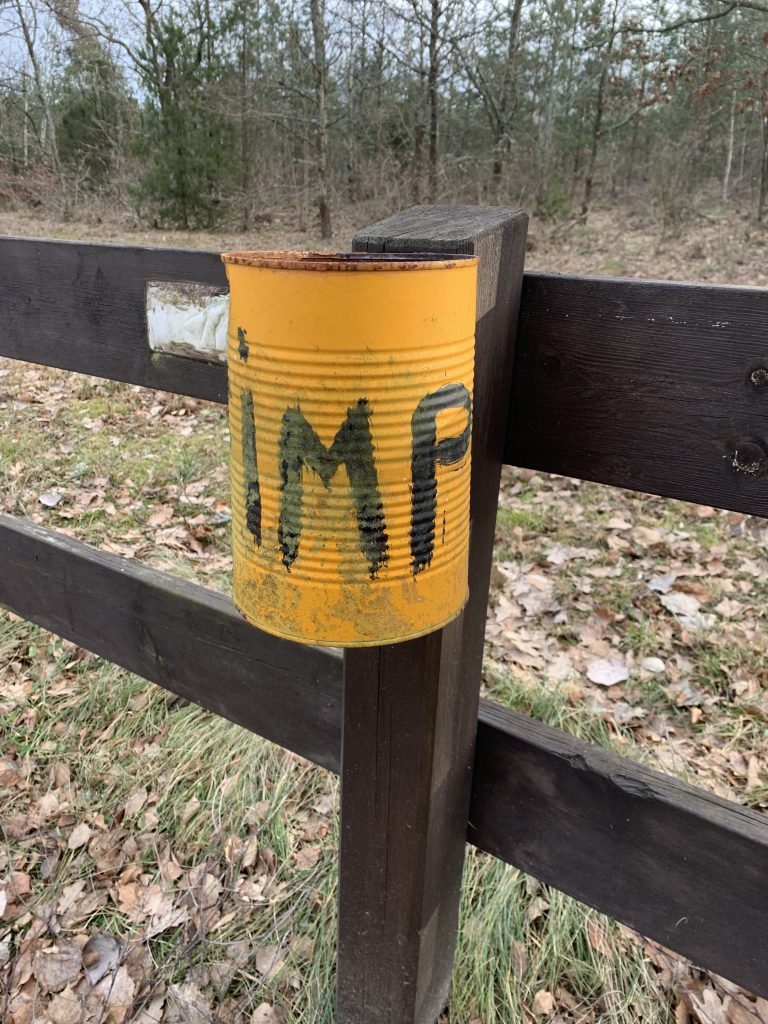
Hand drawn Tratex. This hand drawn replica of Tratex captures the essence of the mentality in Tvärskog, and the identity of this place. These handwritten signs meticulously drawn in an ambition to look like Tratex, possibly come from a slight dissatisfaction of the original signs not covering all directions or being unclear. They might be a reflection of a small irritation of this place not being properly understood or taken care of by the municipality so “we just have to do it ourselves” but with the ambition of it being as much as the original as possible. Which brings a layer of vulnerability to them. The letter spacing is not very even, and they are despite their ambition to be as consistent as possible, full of tension and nerve. I love these, I have a hard time explaining how well these echo this place, but it is a very local sense of mindset–visualised.
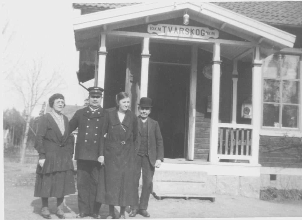
Tvärskog train station. This is signifying the Tvärskog that was and that still is very present in both the cultural and social context of Tvärskog. The people and places from the historical parts are still being referred to as if they were here, the house I live in for example, is never referred to by address, but as “Hjalmar’s house” the parish constable who built and lived in it. These historical figures and places are very much alive in that way of communication. The train station marked an important shift for Tvärskog as it literally connected the community with the rest of the municipality. The letterforms are capital and the R here is of the same character as the one in Mortorp’s Småskola, a wink to Art Nouveau and the rest of the letterforms correlate with that very character.
Reflection
Going into this week I felt slightly embarrassed, as I live in such a small village where there really is not much more than some roads and lots of forest. The typography would most likely not be of the same quality and character as the rest of the people in the module. At the same time I don’t want to neglect it for not being a prosperous product of the passage of time in the same way as the nearest town for example. I did not want to go to Kalmar as I don’t belong to that town and can’t relate to it. I wanted to find something of value out here, and for once let Tvärskog shine, even if it is through the lens of road signs and historical ephemera. Expanding my search to the parish of Mortorp really helped and reflecting on why things are a certain way at certain locations deepened my understanding of the interconnection between the local mindset and typography.
References
Baines, Phil & Catherine Dixon. 2008. Signs: lettering in the environment. London: Laurence King.
Berndal, Bo. 1990. Typiskt Typografiskt. Stockholm: Bokförlaget T. Fischer & Co.
Falk, Valter. 1989. Bokstavsformer och typsnitt genom tiderna. Stockholm: Ordfronts förlag.
Lundblad, Kristina. 2019. ”Texters Form och Formens mening”. In: Kurt Almqvist & Jennifer Paterson (red) Perspektiv på bokens och läsandets förvandlingar Stockholm: Stolpe.
Ridderstad, Per S. 1996. En liten typsnittshistoria, Lund: Avdelningen för bok- och bibliotekshistoria, 1996. (not printed)
List of figures
Fig 1. Fire Station. Björn Jaenssons private archive.
Fig 2. Train Station. Björn Jaenssons private archive.
Fig 3. Blacksmith workshop. Photo from the collection of Sven Nilssons via Björn Jaensson. [online] Available at: https://www.facebook.com/groups/883286232030308
Fig 4. Tvärskog Carpentry factory. Björn Jaenssons private archive.
Fig 5. Dance Ticket. Björn Jaenssons private archive.
Fig 6. Björn Jaensson’s private archive.
Fig 7. Björn Jaensson’s private archive.
Fig 8. Björn Jaensson’s private archive.
Fig 9. Björn Jaensson’s private archive.
Fig 10. Björn Jaensson’s private archive.
Fig 11. Björn Jaensson’s private archive.
Fig 12. Maritha Forsberg. 2020. [online] Available at: https://www.facebook.com/photo/?fbid=3911104358909426&set=g.883286232030308
Fig 13. Maritha Forsberg. 2020. [online] Available at: https://www.facebook.com/photo/?fbid=3911104265576102&set=g.883286232030308
Fig 14. Björn Jaensson’s private archive.
Fig 15. Tove Martens. 2022. Private collection.
Fig 16. Tove Martens. 2022. Private collection.
Fig 17. Tove Martens. 2022. Private collection.
Fig 18. Björn Jaensson. 2020. [online] Available at: https://www.facebook.com/photo/?fbid=3709040182481327&set=g.883286232030308
Fig 19. Björn Jaensson. 2020. [online]. Available at: https://www.facebook.com/photo/?fbid=3443786172340064&set=g.883286232030308
Fig 20-38. Tove Martens. 2022.
Fig 39. Kooperative Förbundet. 2016. [online] Availble at: https://kf.se/en-text-om-blavitt/