Reflections on lecture
I found it intriguing that Smörgåsbord (why is that their name though?) work with typography correlating to a way of talking sort of some of the letterform visualise an idea of how this language sounds
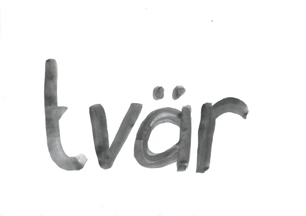
I have not thought about accent before, but it might be interesting to know that the place where I live have a very specific accent. Småländska. There is a difference within the province, down here in Tvärskog, the accent is quite influenced by southern Sweden. Using gliding vowels and voiced retroflex flap and g’s after a vowel is pronounced as j.
My own accent is a hybrid because I come from another place originally, from Vadstena, a place with an even worse accent. So I speak a hybrid of Sweden’s two most mocked accents 🙁
Research
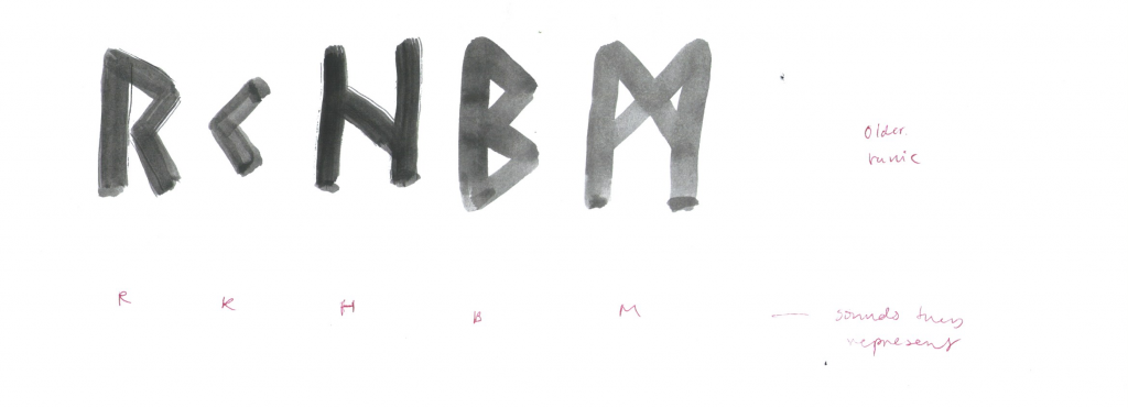
It should be mentioned that Sweden and the area where I live, have some rune stones and/or runic inscriptions, this example is from Valter Frank and show how they looked back when the color was still on them.
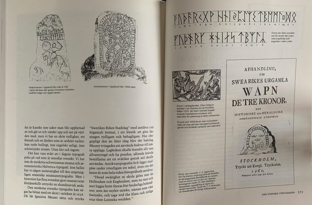
Johann Bureaus who I mentioned last week. The first Swedish man to do a Swedish typeface, was actually a renowned researcher of runic scripts. He wanted to reinstate the runic alphabet in Sweden. Looking at the older (top row) and younger (bottom row) of runes seen at the top right in Valter Frank, gave me the idea to explore the possibility of to some extent meet Bureus wish of at least a few runic letterforms in my upcoming typeface.
Martina Meier, ANRT Nancy symposium on the Gotico Antiqua Proto-Roman hybrid. From 2019.
ANRT are devoting a large part of their research to this very hybrid between gothic and roman letterform that existed during the period 1459-1482. They recently published the book Goticio-Antiqua providing a deeper and wider framework on this somewhat understudied period.

Martina Meier talks about how she was interested in detailing, small seemingly insignificant details ascribing the letterforms quite a lot of character. She also talks about how she wanted to find different shapes of the same letter, and therefore started her project with just basically drawing out letterforms. Open, closed, round, squared, angled. She examines different versions of the terminals. This is something I wanted to investigate if I could implement in my own project.
As she moves on and takes a more firm step towards, but also to some extent, from Sweynheim & Pannartz. When she looks at their work her own work takes a more aimed route. The end result, Armando, is not just a replica but rather an interpretation where she has allowed herself to implement characteristics from her own contemporary perspective. Beautiful work.
Martina Meier’s project gave me the idea of the possibility to derive from something existing, but dare to work out its own character and find its own purpose.
Design development
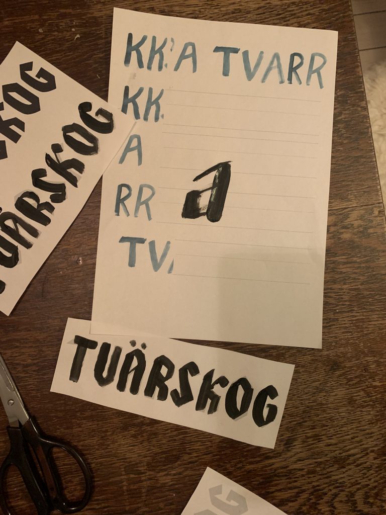
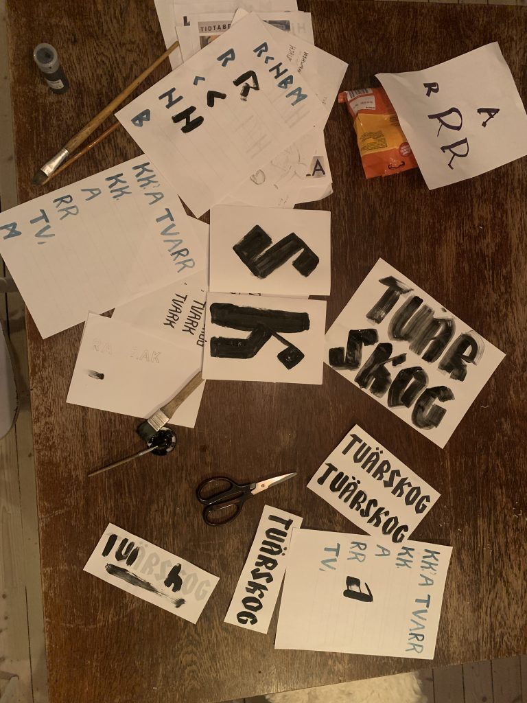
I had to feel the letterforms I had been collecting, I went for an allowing organic and analog approach in the first stage. Just to see if I could find an identity in my collection, if there was any specific characteristics of interest.
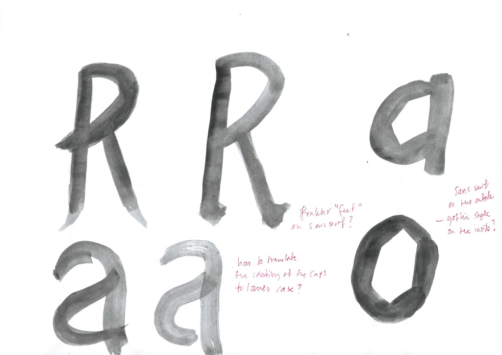
Just tests of letterforms, I wanted to see if I could make a hybrid between a geometric sans serif and a fraktur. But I did not want it to be obvious, perhaps only add gothic style features in the inside of the letterforms?
Yes, that is an attempt to make the letter S 🙁 But the rest of the letterforms in this one I kind of like, some of them seem to belong together? The underlined ones.
An attempt at my own handwritten Tratex, I just feel like this is not what I want to purse. But at least wanted to try.
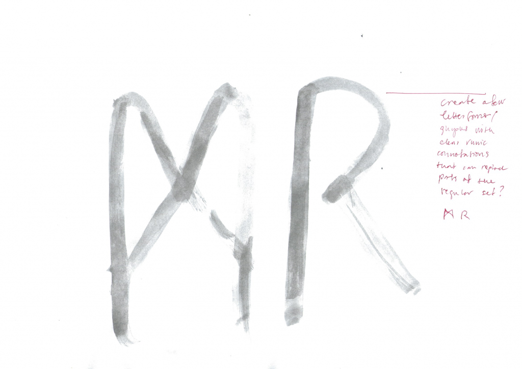
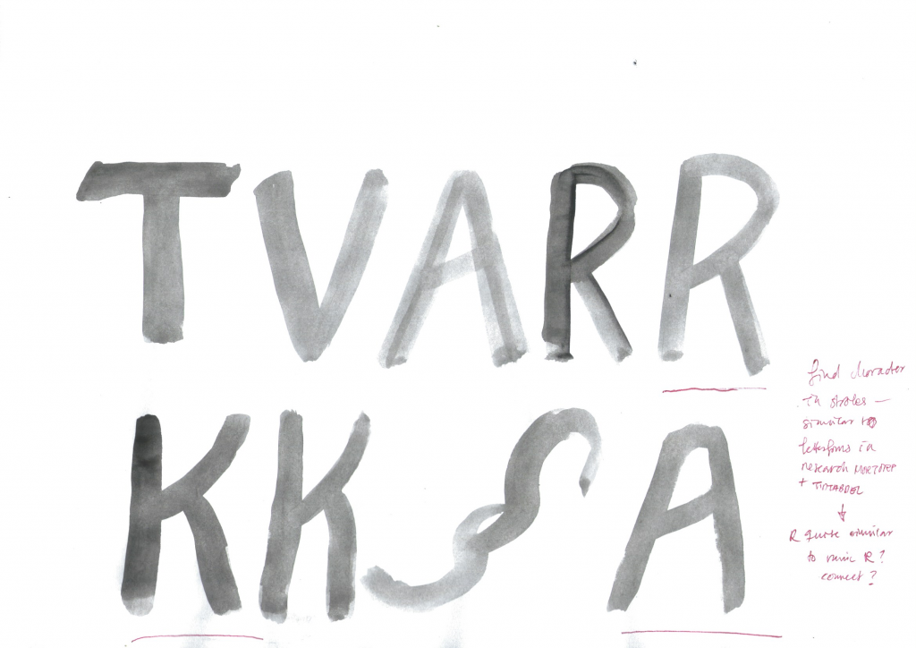
Trying out runic letterforms that could replace some of the regular ones.

Taking these letterforms into the computer I just tried to find some kind of signifying piece or a stroke that could be found in most letterforms to get that sense of continuity.
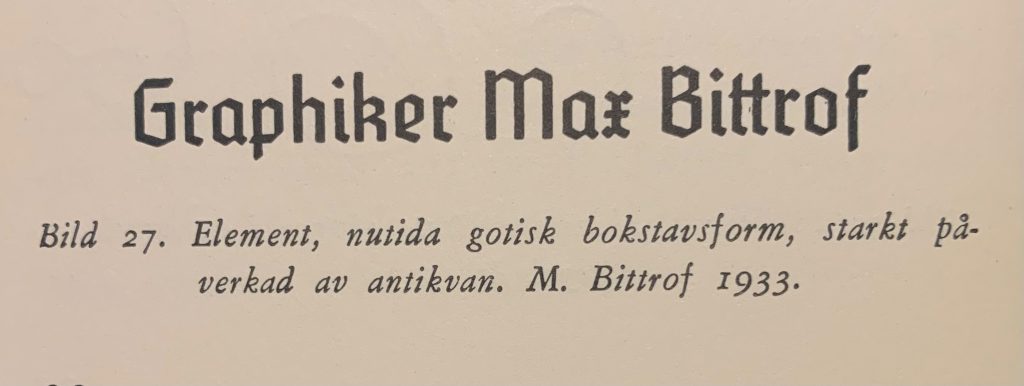
After some sketching I felt as the letterforms were to organic, to rounded. I wanted to at least try and implement a feel of gothic style, but not an overwhelming one. I had a look in one of my books and found this from the 1930’s.

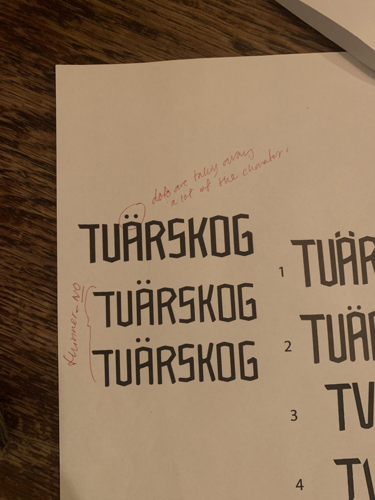
Called a friend who is a book designer and she said the first one connotates outdoor life and there is a non-profit association in Sweden working with outdoor life which she mentioned. She said it looks like chopped pine tress. These are all very appropriate connotations to be honest. She asked why I prefer the second one and I replied that it feels a bit more processed/worked on? To which she could agree but thought the character of the first one had a clearer reflection of the Tvärskog I wish to portray.
Votes from the ideas wall says nr 1, 2 and 4. The person who prefers the first one did point out that the second one looks like a friendlier version of the first.
Printed them out and had a closer look.

Being unsure of the route I had started on I wanted to explore something else, the first ambition with this new direction was to see if I could find a “sophisticated” blackletter/gothic style as the one in the church in Mortorp, and work with a feel of the letterforms being folded, as seen in example 4 from my first sketches. The letterforms in the church are lower case though and I wanted to work with Caps so I collected some possible routes for that on a moodboard.
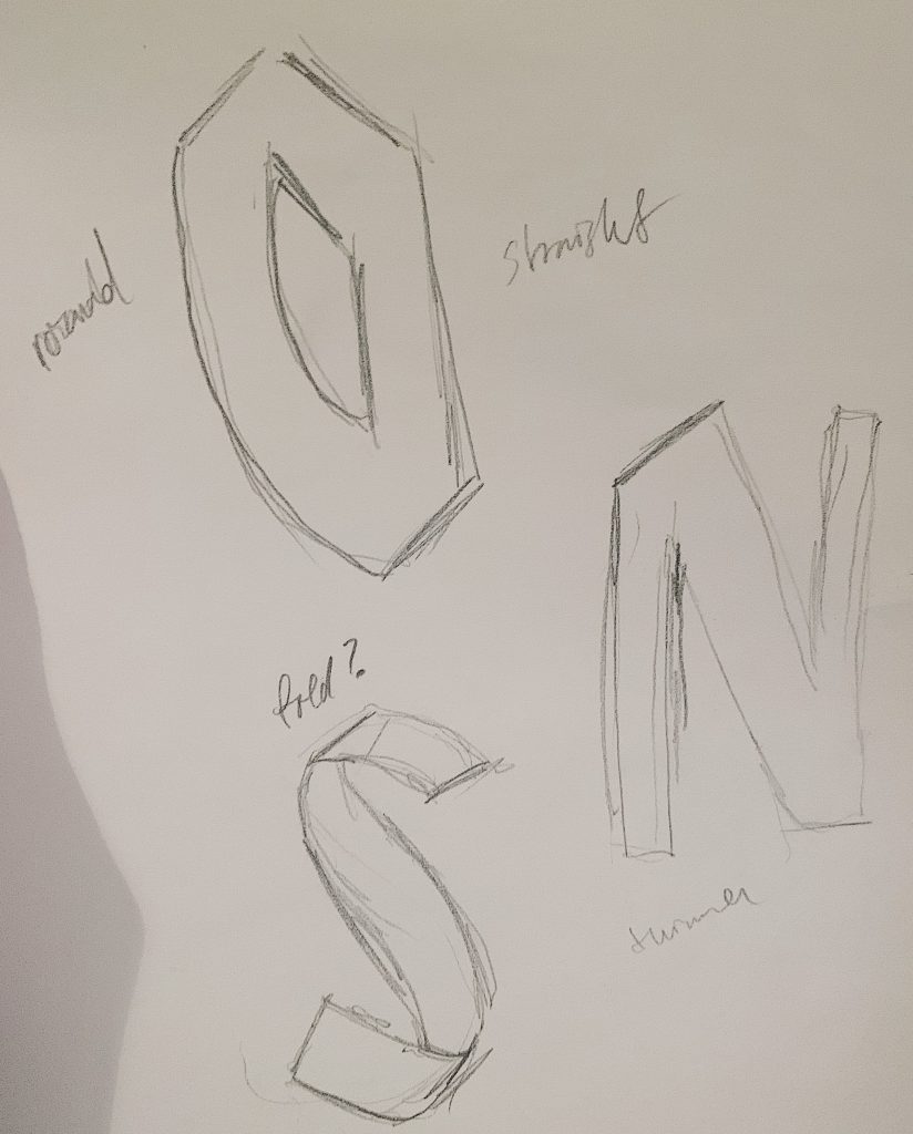


I worked out the out the O quite similar to an existing one from one of the pieces on the moodboard and the drew the rest of the letterforms from the character of the O. It was super hard. But I had to try.

It is not very sophisticated, it feels like every letterform I try to work out looks like something out of a clumsy comic book.

Here are the two possible routes next to each other. I need a little break from this and to get back with fresh eyes at a later time.
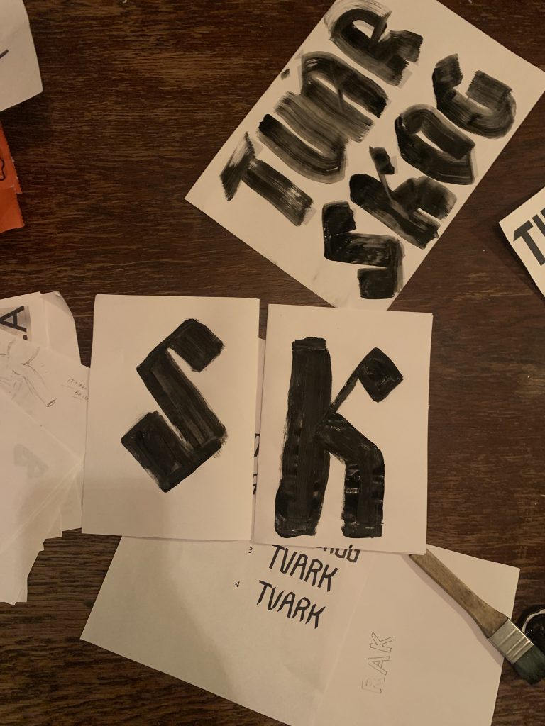
I tried to work out these letterforms with a brush instead, did not go very well.

I tried adjusting some of the letterforms in the computer but this is when I abandoned this entire idea. The first path is a better option and is something that is much more in line with my research and this place.

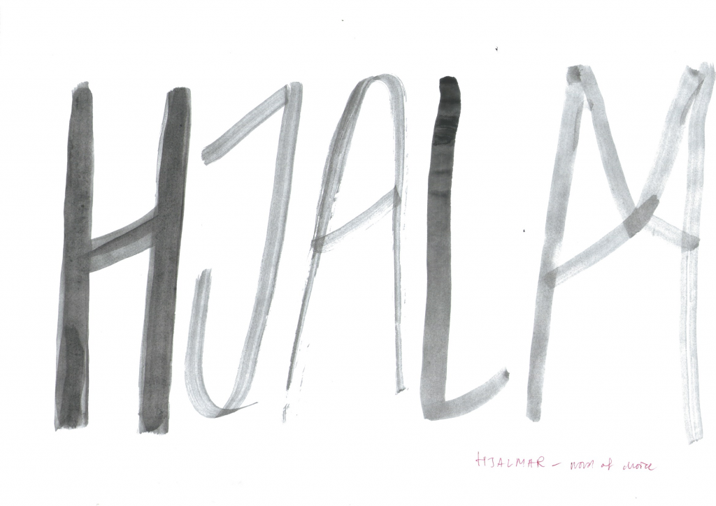
I kept working on that type and it got better, I tried making a runic M and it got better than expected. I think I will name the typeface (well, the few letterforms) Hjalmar. Hopefully I can get some time to see how I could have implemented this or make a mini identity out of it.
Final outcome
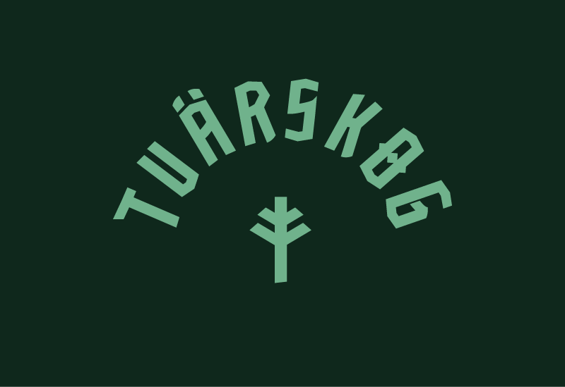
Seems that the thing missing all along was a pine tree.
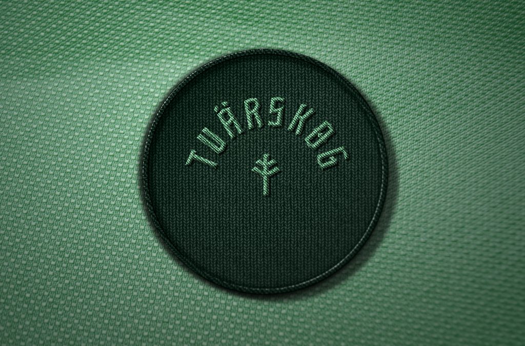
I had to find some context for this, and did this little booklet above. The format is based on the time table that I found in my research last week.
References
Falk, Valter. Nutida typsnitt. Uppkomst och utveckling.