Lecture reflection
Migrant journal is a really beautiful magazine, but in what ways is this not aestheticising and simplifying some deeply problematic aspects of our global world? And for whose gaze? In the lecture, Steve says:
“But whereas that tends to mean, or at least it gets wrapped up with ideas of asylum seekers and refugees, the makers of this magazine deliberately wanted to expand beyond that and take a wider and more ambitious view. So, while asylum seekers and refugees are included here, migration itself gets interrogated. “
Imagine fleeing terrorizing war just to have a white man making a magazine let you know that asylum seeking is not “ambitious” enough for his publication. I know I am purposely misunderstanding what he says when remarking on that, but it is worth noting that it takes a lot of privilege to be able to think that way and to be able to curate humanitarian catastrophe’s for a reading target audience in the west.
Research
I wanted to look at inter- or transdisciplinary research groups and/or journals where the subjects interlace and feed each other. Spaces for collaboration.
Deem Journal
Deem is a biannual print journal that also also exists online. They utilise transdisciplinary dicussions as a way to look at design.
“I think Deem is for people who don’t always see themselves represented in media in a way that’s satisfactory. It’s for people who want to reclaim their rightful place in design conversations. It’s for people who have felt excluded from things that they feel deeply about.”— Larenz Brown
“I think Deem will show a way to be more democratic when considering the world of design while still upholding design’s pillars. It’s not, “Hey everyone, no need to get a degree in anything, just come along” but instead really showing how these rigid subjects and professions actually translate to other industries that you may not consider, you may not even deem related. It is at that intersection where interesting things start to happen. Deem aims to uncover, create, and facilitate these intersections.” —Nu Goteh
Speculative life research
“Speculative Life is a research cluster at intersection of the humanities, social sciences, design and art. Our research activities focus on critical approaches to the environment, infrastructure, biomedia, digital culture and AI. Established groups in the cluster include the biolab, critical Anthropocene research group, critical practices in material and materiality, disrupting design, the concordia ehtnography lab, financialising infrastructures and machine agencies”.
–> https://speculativelife.com/critical-anthropocene
–> https://speculativelife.com/disrupting-design
Engaging Vulnerability
https://www.engagingvulnerability.se/
Engaging Vulnerability is an interdisciplinary research program at Uppsala University financed with the support of the Swedish Research Council (Vetenskapsrådet). Some of the names in this group have been valuable nodes in navigating the research for my project proposal.
Memory and Uses of Pasts
This is one of the research group that strongly relates to my own interests with the exception that it is within the discipline of history. But can still provide some valuable insights.
“The Research Group Memory and Uses of Pasts (MUP) investigate how people use pasts in different social, temporal and spatial contexts for various purposes. Exploring how people connect past, present and future. Focusing on how people process memories and how people weave their own personal life stories into different forms of communities of memory. They are interested in the processes that determine what is remembered and what is forgotten and the power-related implications of these processes. They are contributing to the multidisciplinary research field’s theoretical development and working across time and space.”
https://ruc.dk/en/forskningsgruppe/memory-and-uses-pasts
Aesthetics of Empire Research Cluster
This cluster is very relevant to me as I aim to discuss with Linnaeus University on the possibilities for me researching there. I feel as if my subject could fit within this cluster and especially as it also is within their centre for Concurrences in Colonial and Postcolonial Studies.
“The Aesthetics of Empire Research Cluster within the Linnaeus University Centre for Concurrences in Colonial and Postcolonial Studies examines cultural media – literary, visual, aural and others – in light of these circumstances. Motivated by a sense that cultural production matters in the shaping of material realities, the cluster explores how texts affirm, contest or subvert imperial agendas, both historically and into the present. Cluster members join with conversations at the frontline of postcolonial studies by examining not only how different imperial situations have been represented in texts, but also how textual imaginaries participate in making the world legible to imperial agendas, and how they contest, critique or disrupt these processes into the present.”
https://lnu.se/forskning/sok-forskning/forskningsklustret-for-imperieestetik/
Design Research Society
https://www.designresearchsociety.org/
The Design Research Society (DRS) is a learned society committed to promoting and developing design research. DRS has engaging community forums and activities for members.
I joined this as a part of my “action plan” for my Phd Proposal in Brief 1.
Insights from research
This above is only a fracture of the amounts of reading and researching this week, it is hard to document it all. I am noticing that I am moving more and more away from graphic design and more into the discourse of design. I am not really interested in looking at graphic design, but rather discussing it or the meaning-making behind it.
Workshop Challenge
The formulation of finding something historically significant stuck with me and I turned to my favorite bible–the Complutensian Polyglot. Such an interesting piece, in layout and typography. But also everything surrounding it, and Francisco Ximénes de Cisnero, a former grand inquisitor who was given some free range in this quite controversial humanist project of translating and publishing a multilingual bible in 16th century Spain. This project relied so much on the collaborative forces that made it possible, the scholars, the printer, Ximénes and his social capital giving them a head start, but that later caused him to not even see the polyglot being published.

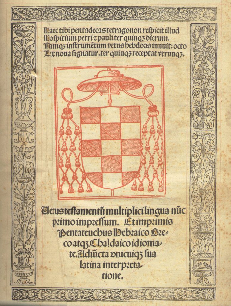


The layout is a nod to the Polyglot–consisting of five columns. This in a more contemporary clothing.
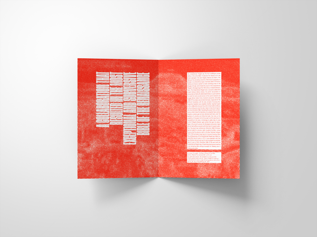
This outcome felt to polished or just lifeless. It was also a bit too red. I rather wanted it the same color as Ximene’s emblem. And I wanted to implement some more texture, so I printed it + scanned it back in.
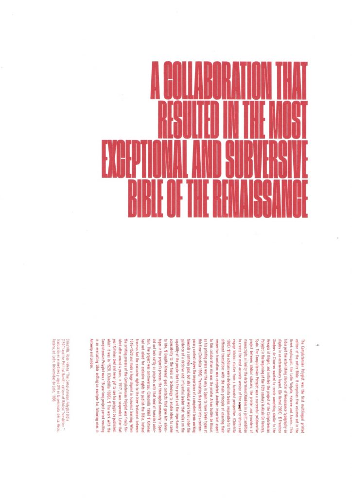

My printer is struggling a bit these days so part of the print came out yellow. No worries though as some color adjustment was on the to-do list anyway.
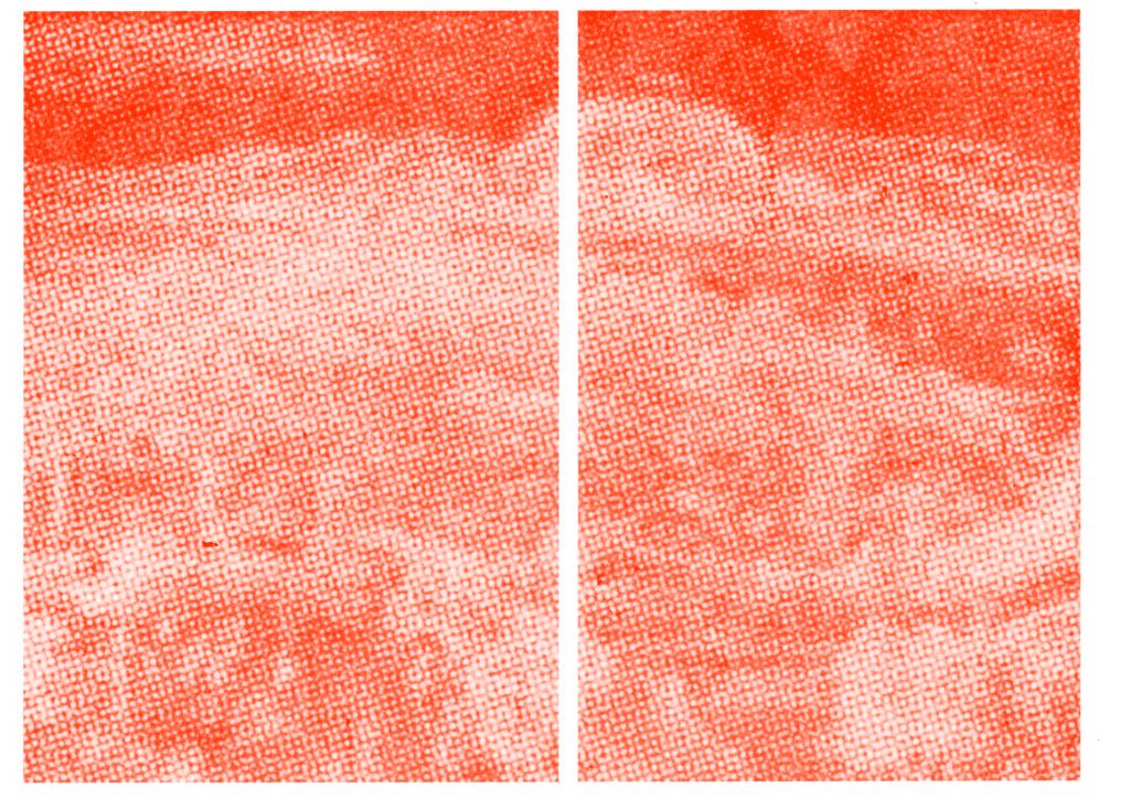
Final outcome

Five columns to echo the Complutensian Polyglot, little sublime nods here and there to one of the most beautiful bibles out there.