Intended activities week 6
Research
→ Reading, approximately 80-100 pages/week
Van Leeuwen, Theo. Introducing Social Semiotics.
→ Map visual artefacts from the Early modern era.
Mapping the Early modern age
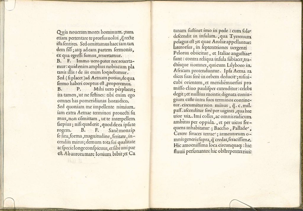
I need to have a better look at the visual language from the early modern period and I will begin with some visual research from that period of time (1450-1800). This is in ambition to find suitable artefacts and get some clarity in how I will collect and categorise artefacts.
The reason this project focuses on the early modern age because it is a time period that encapsulates both the Renaissance and The Enlightenment, two eras in which Western ideologies took form and was refined.
A new world image formed during the Renaissance, and the humanistic age began, an organized and structured era where the human rather than god was positioned at the center. A new approach to knowledge that looked to science instead of only god. Europe was still very christian though. But technology enabled new way of believing in god.
I have been watching some lectures from my friend Lina. Lina teaches Graphic Design History and even though most of her lectures contain things I have read about and studied myself, I just really love her selection of examples and how she so efficiently explains how greater societal shifts can echo in even the smallest visual details.
Artefacts from the Renaissance
Including notes and extracts from Lina Hultberg’s lecture.
Moveable type (not to be mixed up with the invention of print…)
Moveable type was a new technology the changed the way to layout of the page. It enabled to arrange the separate letters.
Modularisation of page layout, as seen in Sermones Discipuli printed by Anton Koberger. Modularisation meant that the components could be exchanged. This can be considered one of the starting points for modularisation in book printing.
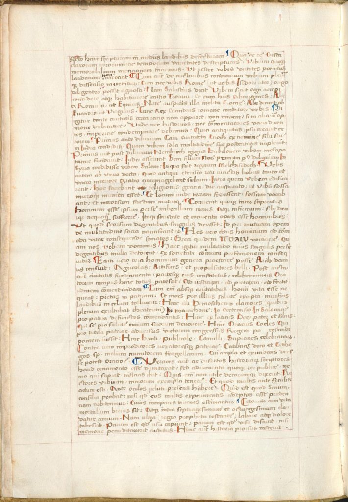
Grids defining margins, running heads etc. In the Nuremberg Chronicle 1483 by Koberger there was no page numbers yet, but clearly outlined margins. This book provides relevant insight to when these notions of macro typography and navigational systems in book design started taking form.
King James Bible is clearly showcasing the use of grids. However, this is 17th century.
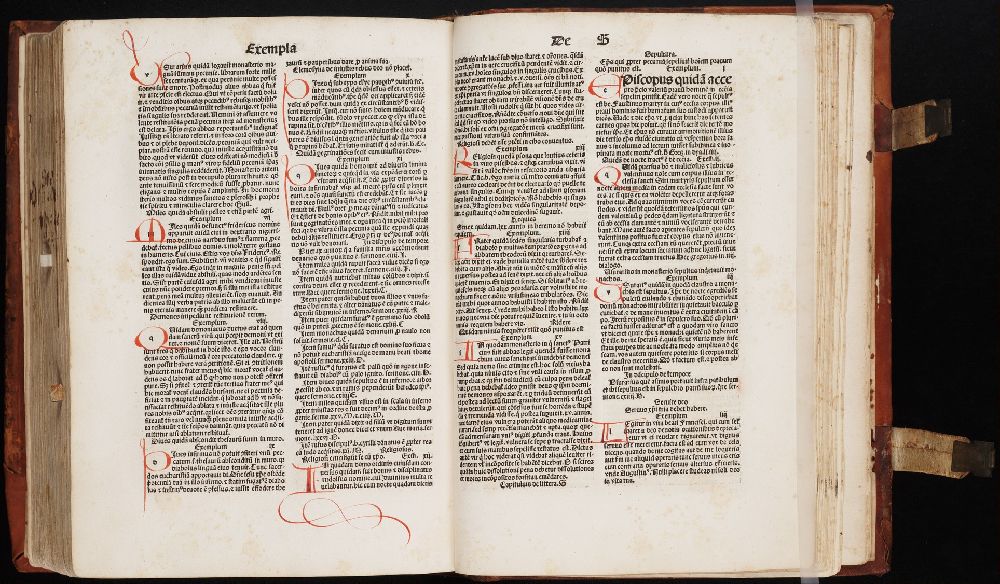
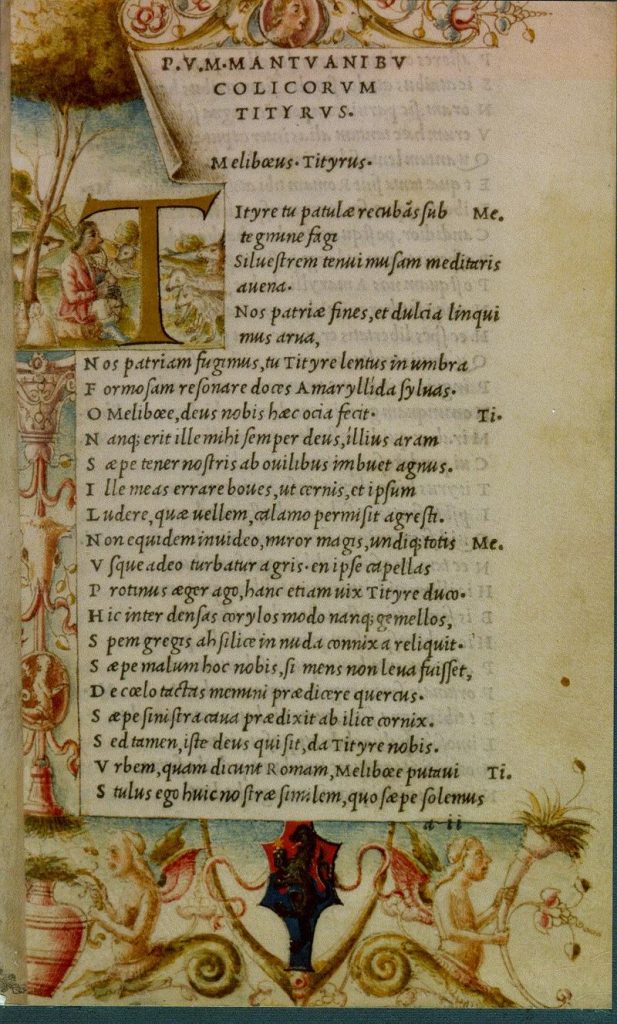
Lina showed The Conquest of East India, from 1582 as an example to display different text types to differentiate different text blocks: page numbering, running heads, preamble/intro text (set in serif typeface), subheads in serif typeface, drop caps, attribution of authorship, name of printshop publishing place and year, name of translator, introduction in serif. These parts were then established and working, these are parts we use today.
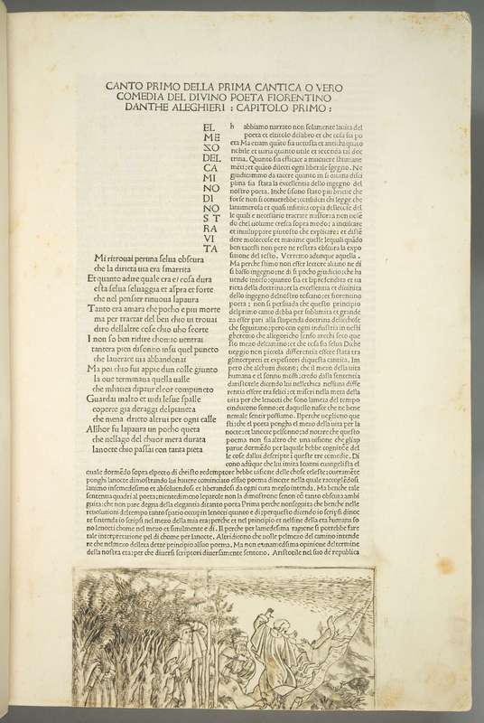
Canto Secondo by Dante Alighieri, Florence 1481. This book is showcasing different text types in for example contrasting type size, negative space etc — The typography has a very clear connection to contemporary type setting (Lina showed a contemporary example from Lausanne that was striking in resemblance)
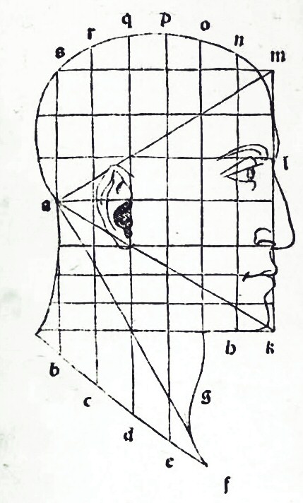
Typography & ideal geometry
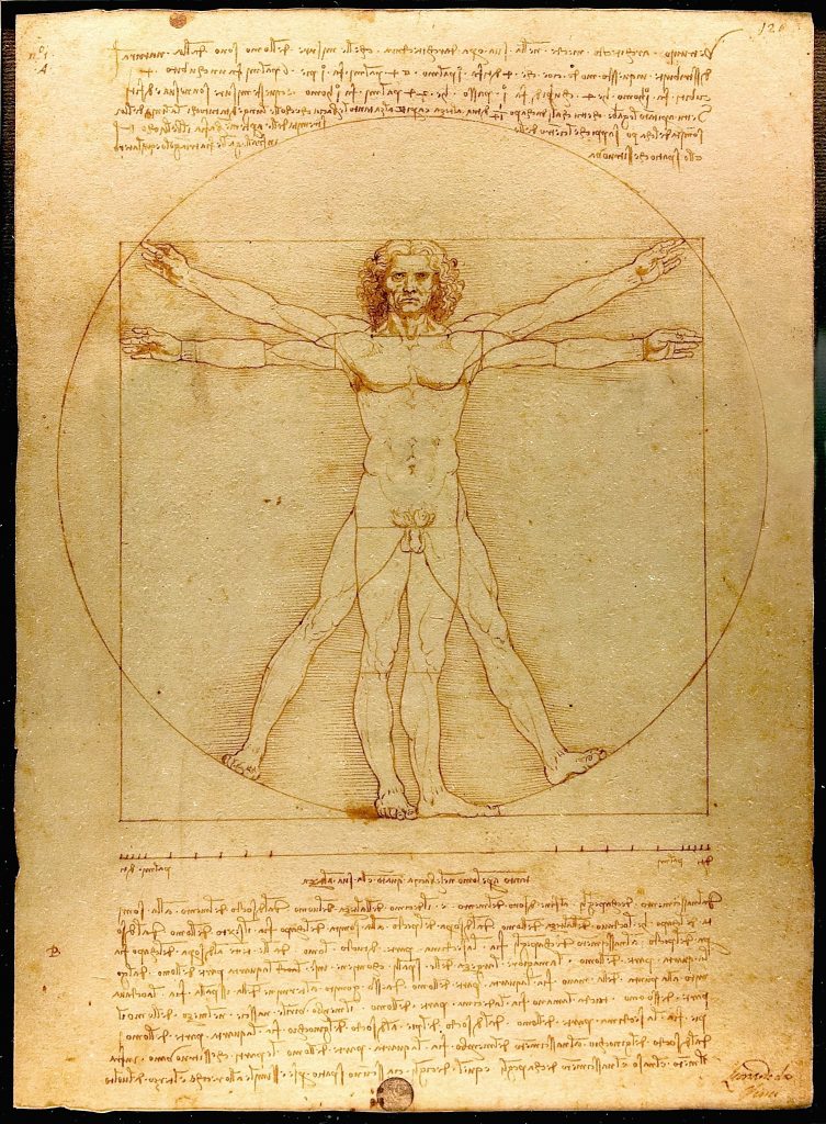
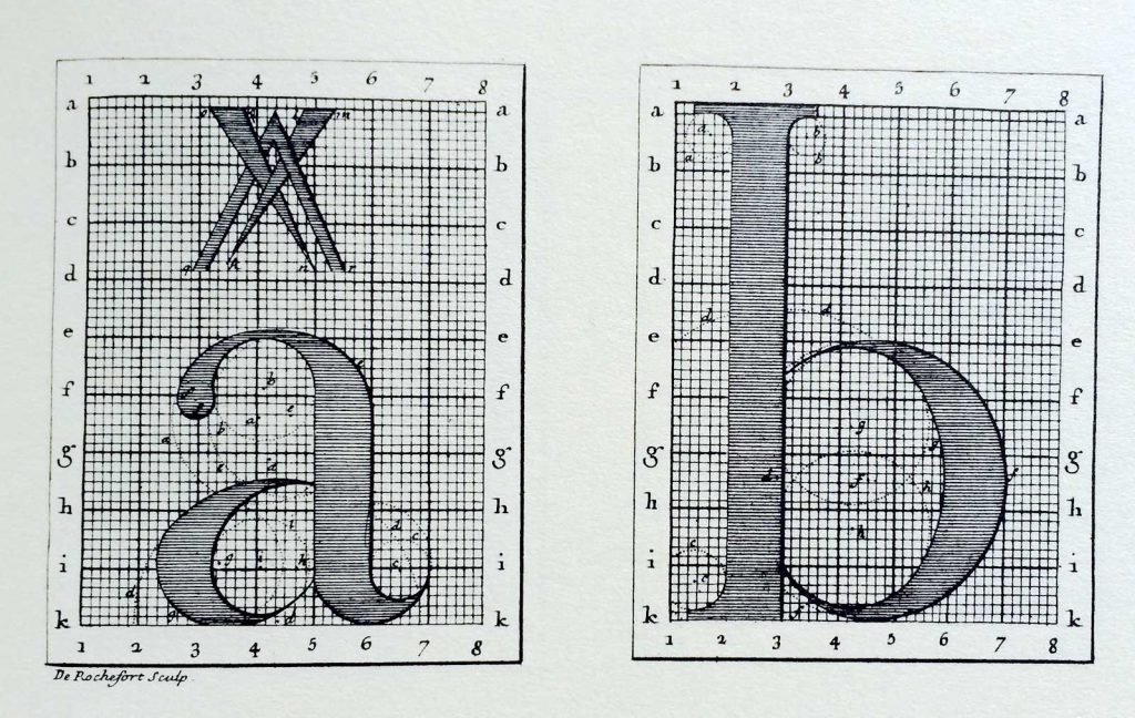
Lina talked in her lecture about how in Renaissance Italy, an ideal geometry was attempted to be established, that they believed ideal geometry must be inherit in natural forms, human head and body. There were attempts to find the perfect proportion of human head for example. The Vitruvian man is an example of this exploration. This theory was derived from roman architect Vitruvius , claiming that the perfection proportioned human can make a perfect circle and a perfect square.
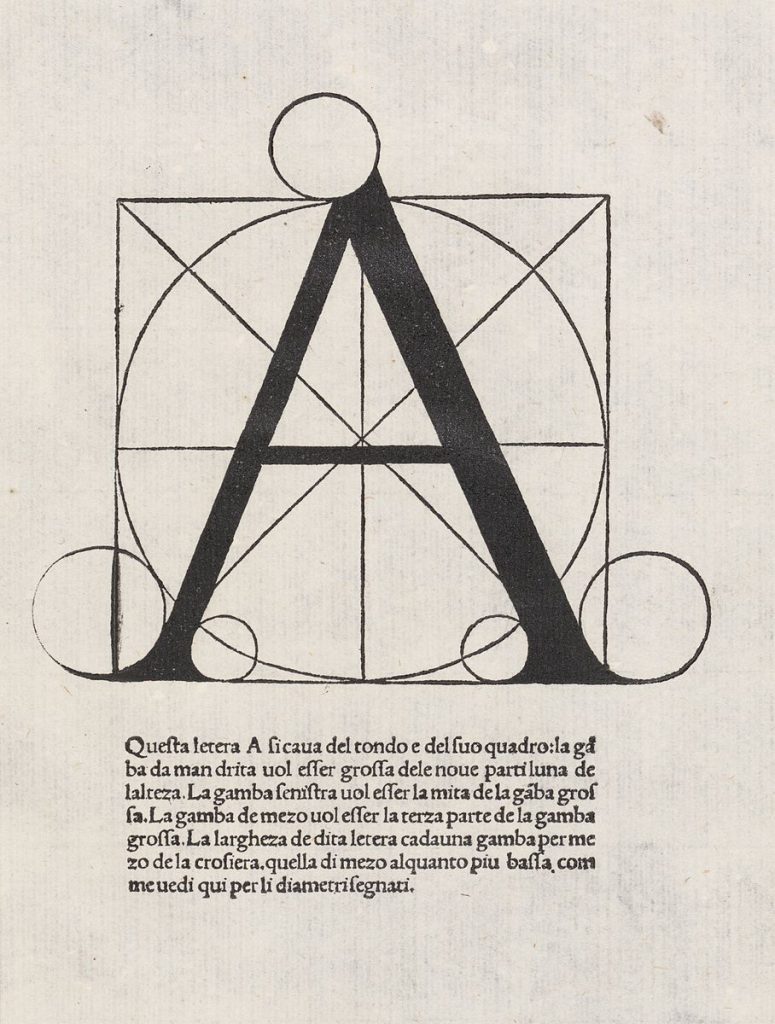
Golden ratio
The golden ratio became an instrument for rational proportionality during the Renaissance. It is described in Divina Proportione from 1509, by Luca Pacioli.
It was a mathematical treatise and in it was examinations of proportions of the human face for example, and letterforms. The book displays classic roman majuscles as geometric perfect letters and showcase how they correlate with ideal geometry and the golden section.
The main reason for using geometry in the renaissance was it was believed that it produced beauty and harmony. It was also an expression of control over nature, a way to construct a sort of perfection that nature could not. This reasoning strongly relates to ideas that were even more defined during the Enlightenment, and to Descartes and the separation between man and nature.
Humanism perceived man as the center of the world. this was one way for man to be sovereign of nature. Humanism established humanity’s ability to rise above its conditions.
Mignolo (2018) describes humanism as “a set of discourses enunciated by agents who identify themselves as human and who project their self-fashioning ontology to a universal scale”. Mignolo means that the concept of the human was formulated under humanism, and was projected onto the rest of the world. Humanism served as a measure of what could be included into the concept of the human. Humanism grew into a civic framework and in “Managing and controlling the idea of human and humanity allowed those who define and are allowed to identify as such, to establish a hierarchy among humans: racism and sexism served that purpose.” (Mignolo, 2018). Mignolo positions humanism as one of the constituting parts of the Colonial Matrix of Power in relation to modernity and coloniality (Mignolo, 2018).
Drucker (2013) mentions how this aspiration towards humanism positioned human beings at the centre of knowledge and understanding. This was the prelude to the logic of the Enlightenment where this ‘human being’ became a more distinguishable figure in the form of the European man and anyone beyond that description was considered an ‘other’. This logic and ideas became institutionalised through print.
Typography
Drucker (2013) underpins the ideological role of typography as she discusses how the development of graphic design and typography during the Renaissance grew to spread ideological values stemming from humanism and Eurocentrism.
This can be seen in the development of Roman type in italy. The Roman majuscle was combined with a miniscule –called humanist miniscule (1497-1500). This is what Pannarz & Swenheym did with the Subiaco. The origin of the Roman type came from exploration of past scripts. These scripts were reinvented through a filter of humanism and made more suitable for technical development of print.
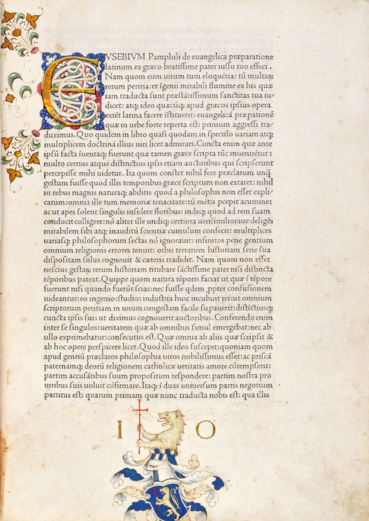
Nicolas Jenson’s typeface’s importance was rooted in their legibility, Jenson’s type had a perspective on typography that had not been as recognised before. The interspace shapes in Jenson’s letters gave the book pages an even tone. In Nicolas Jenson’s setting of Gospel preparation, written by Eusebius, the Roman can be seen in established form.
Aldus Manutius
The Italian Renaissance was characterized by humanism and Aldus Manutius was a key figure who upheld these new ideals and incorporated them into his printing at the Aldine Press in Venice in the late 15th century. Roman and italic letterforms emerged as dominant during this period, although the use of italics in books over time went from being used as primary to become merely distinctive. It was most common that Gothic style and roman were used based on the content-related premises and character of the text, Latin texts, for example, were usually set in a roman.
Aldus Manutius also reduced the format of the book and thus became the reason for the increased popularity of the octave. It was in one of these “pocket books” of that time, Aldines, more specifically in Virgil’s opera, that the first italics appeared.
Bembo was a typeface suited for the smaller format, octave.
France
Lina said in one of her lectures that “Printing was born in Germany, developed in Italy but it was in France it really flourished”.
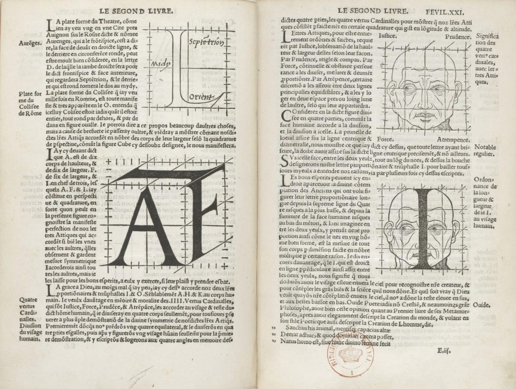
Geoffroy Tory. Champ Fleury- 1549 compared the proportions of the Roman letterform with the ideal proportion of the human figure and face, Tory also presented the latin letterforms as geometric constructions upon a grid created from 100 squares.
During the 16th century, the Gothic style began to be replaced by Roman type in most texts in both Latin and the vernacular. Typography took a direction towards what was more adapted to the printing process. Instead of imitating handwriting with letterforms that imitated the pen’s hand-holding, typefaces developed that were easier to print and had their roots in printing and the process of making movable types. Claude Garamond’s letterforms reflected this development with typefaces known for legibility so high that they according to Meggs eliminated gothic styles in compositors cases all over Europe, except Germany.
The scientific advances could be seen in typography. I own a book about french type called The Palaeotypography of the French Renaissance. I will have a look in that for further inspiration on possible artefacts from this time and place.
Artefacts from the Enlightenment
Including notes and extracts from Lina Hultberg’s lecture
The Enlightenment included the scientific revolution, modern science. Scientific methods was key through this time. Trust in human reason. Man was at the center of knowledge and had the power to understand the world around him.
L’esprit de systéme
The spirit of systematisation , ordered, classified, organized,
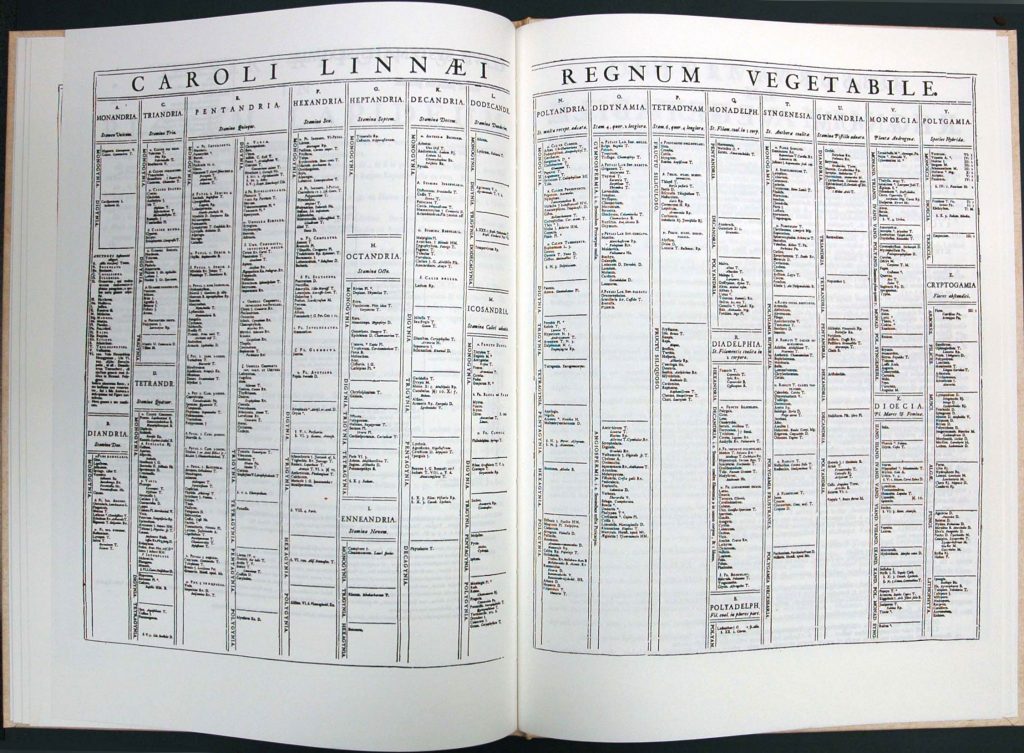
Carl Von Linné. Father of modern taxonomy created the Systema Naturae in 1758. It contained a visual method of tables and brackets that made clear how different classes branched out into smaller groups.
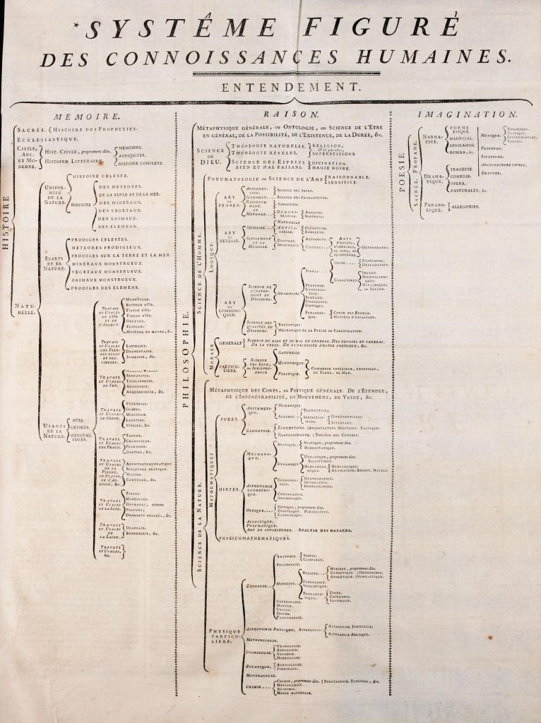
Encyclopédie, France 1751-1772. All known knowledge in one series of books. It was organized and structured, an incredible body of knowledge and information.
Data visualisation and interpreting data
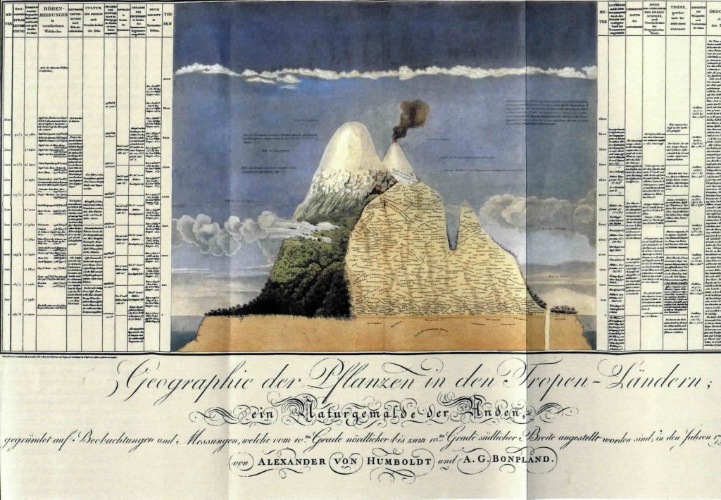
Humboldt was a scientist that created this map that interpreted data. It indicated precipitation and other measurements that had been taken from this mountain, the Chimborazo.
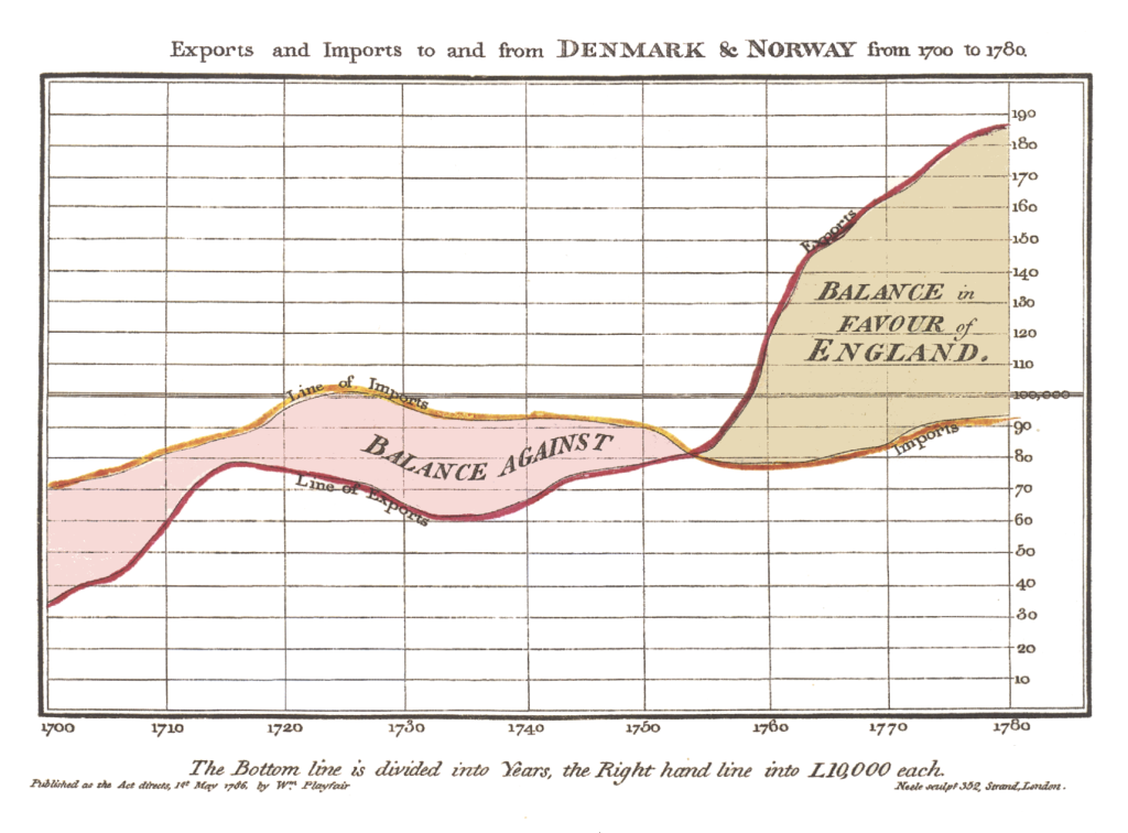
William Playfair had Rene Descartes work as a starting point. Playfair made symbolic statistics. Line chart 1786. His work was perceived as hard ‘objective’ ‘scientific’ way of showing numbers.
A lot of these systems that mapped out and measured nature were imposed on the world. They established hierarchies and positioned man as sovereign over nature and anything considered to belong to nature, anything ‘uncivilised’. For example Carl von Linné’s, Systema Naturae, Linné classified the human species and there were four varieties that corresponded to the four known continents of that time. but in the 10th edition they are more elaborate with temperament, skin colour, etc. The European was described as “white cheerful, muscular, wise, inventor, governed by religion.”
In Lina’s lecture, she discusses how this classification became a dangerous tool and an interpretation of the natural world in a scientific manner. It imposed a system of hierarchy among humans and that hierarchy.
Rococo
Rococo had a lot of ornamentation, the design was lavish with organic lines, pastels, light colors, leafy garlands and flower decorations. Typography was refined and much more strict than before.
During the 17th century, the approach to typography was drawn towards a more distinct scientific approach when the French king, Louis XIV, wanted to produce a typeface for the royal house. To accomplish this, a mathematician had to take on the task in what can be seen as the genesis of the transitional type. This transitional form reached its full glory in the 18th century when John Baskerville drew his sober typefaces with distinct contrasts between hairline and base, these letterforms link the earliest Renaissance letterforms with the didones that emerged in the late 18th century.
List of artefacts for consideration
Here are the some artefacts from this research that I will consider for this project:
- Moveable type, as seen in incunables.
- Modularisation of page layout as seen in Sermones Discipuli by Anton Koberger.
- Establishing typographic hierarchy, as seen in for example The Conquest of East India, from 1582 and Canto Secondo by Dante Alighieri, Florence 1481–This book is showcasing different text types in for example contrasting type size, negative space etc — The typography has a very clear connection to contemporary type setting
- Typography & ideal geometry
- The Golden ratio, as seen in Divina Proportione from 1509, by Luca Pacioli.
- Development of the Roman type, as seen in Venetian book design.
- Aldus Manutius, and his work with the roman as seen in Bembo, his work on format, as seen in the octave, and his italic.
- Geoffroy Tory and his work seen in Champ Fleury from 1549 that compares the proportions of the roman letterform with the ideal proportion of the human figure and face.
- Carl Von Linné and his work presented in Systema Naturae, 1758. A visual method–tables, brackets, making clear how classes branch out into smaller groups.
- Diderot, Encyclopédie
- Romain du Roi
Reflection
What ideas and visual expressions unifies this time and how can that be interpreted into a “visual identity” for the ‘bundle’? Humanism is a sort of instigator to the formation of the harmful ideals of the Enlightenment’s categorisation in the name of “science”.
I was considering to make all different printed products as a sort of puzzle that is based on the golden ratio. And when everything is arranged according to the golden ratio one side will portray all abstract visual interpretations of all the artefacts, and the other side will present some kind of linear timeline (maybe).
References
MEGGS, Philip B. & Purvis, Alston W. 2016. Meggs’ History of Graphic Design. Hoboken: John Wiley & Sons, Inc.
MIGNOLO, Walter and Catherine e. WALSH, 2018. On Decoloniality : Concepts, Analytics, Praxis. Duke University Press.
DRUCKER, Johanna & Emily mcvarish. 2013. Graphic Design History. 2nd edn. Pearson.