Research & Analysis
Reflection on lectures & ideas wall
I was intrigued by last weeks webinar and the introduction to writing critically, reflect and learn to take new perspectives. I was also a bit ashamed of myself when Joseph mentioned the ambition to “decolonise the curriculum” since I had, not once but twice, shown my old German bible. Historically, a vehicle of oppression. I am as well focusing quite a lot on the global north when investigating typographic history, and often catholic bibles. I have felt for a while that I am taking a narrow and unrepresentative view of history and that I need to look further. Seeing this week’s theme including Globalisation I got excited and saw an opportunity to evolve.
But then I was actually quite confused on how this subject was approached. I was surprised of the lacking knowledge, some even confessing to not knowing the definition of globalisation or its meaning– yet speculating. But a few things were definitely worth highlighting. Simon Manchipp said “there’s a lot of negativity surrounding globalisation and how it’s leading to a homogenisation of thinking, but actually I think the opposite is true”, which is something I also briefly discussed on the ideas wall as an answer to Wes question on globalisation.

This is a subject that interests me even though I don’t know much about it. Halfway through commenting this week I realised that this is a British context, and some of the people I am discussing this with grew up in Britain during the Thatcher era for example. Which was a time for constructing neo-liberal economic reforms in England, also further verbalising globalisation even if it has been around for a long time. So that obviously inflicts on others perception of the matter, as it should. But also, more recently, Brexit, which can be seen as an indirect consequence of globalisation. When a nation’s identity gets more vague in the connection with the rest of the world (in terms of borders, currency etc), sometimes efforts to preserve that identity can result in breaking those connections. Obviously a very simplified view. I will now stop discussing British domestic politics, about which I know nothing. But in the future, I should respect and take into consideration our different backgrounds and perceptions of the world. Fundamentally I want to believe that I am that kind of person, but in reality I think I can be sort of immediate when it comes to getting my idea forward.
Regular Practice said: “visual culture has become a little bit more uniform across the world.” I would like to respond with a quote from Arturo Escobar: “only privileged groups can afford to overlook as they act as if the entire world were, or should be, as they see it.” Regular Practice’s statement might have some truth in it, but it is a statement from an ethnocentric perspective.
Later in Harriet Ferguson’s lecture, she discussed how global collaboration gains a lot from globalisation and gave a bit more depth on the matter.
My personal view is that with graphic design comes power. You can construct narratives — may them be true or false. But with that follows a great responsibility, as a white woman in the global north I should definitely tread lightly before generalising on cultural matters, from the global south, for example. As a graphic designer and member of, well the world I guess, I am responsible for keeping my frames of references sustainable and up to date. Looking at Harriet Ferguson’s lecture, it was multifaceted and quite interesting but contained some problematic point of views, for example in regards of creating a brand for tampons in China.
“The Western approach to design was one of the main reasons the client came to Pearlfisher, as the aesthetics of the West are seen as premium in China. It’s a different version of ‘the grass is always greener’, right?” If the statement ‘aesthetics of the West are seen as premium’, is true, it is definitely worth reflecting on why, and where that comes from even in a role as a graphic designer. Maybe ask why we are constructing a brand based off western aesthetics for a Chinese market? Perhaps specially coming from a heritage as one of the major colonial powers? Could it be because “the grass is always greener” or is it worth investigating wether that could be a part of globalisation’s impact on China? Is there a responsibility to take in a branding project like this? Then whose is that responsibility?


Ellie brought up something very relevant, namely appropriation. Raising some important questions.
Design development
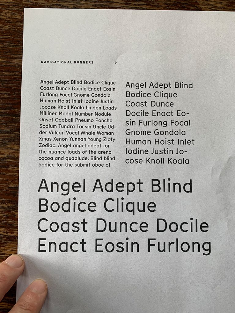

A print test of my typographic hierarchies for the editorial pdf for Challenge 1. I just wanted to see them in print, if they work out. The sizes are based on the leading to fit in the grid.
Final outcome
Challenge 1
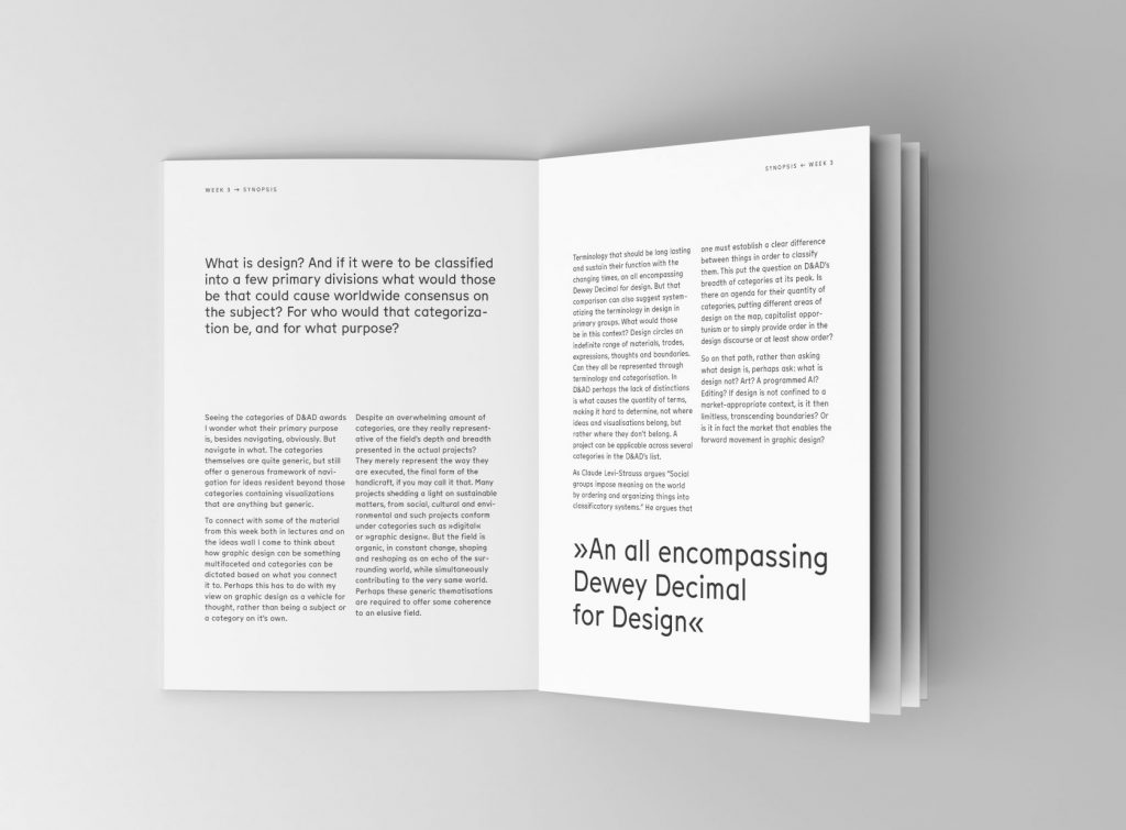
Reflection on visual outcome: This way of working is not a risk for me, constructing a grid and applying a simple typographic hierarchy. I could definitely challenge myself more. This early in the course it is quite comfortable to resort to old ways though. If I were to take this project further I would look at possible ways to deconstruct this composition. I would explore the compositional options beyond the grid and try to approach a structure that would make me sweat a bit.
Since I am originally taught to work rule based with classic typography, I am a bit unsure on how to go beyond that. Typography has always been a safe haven for me because of its certainty in “rules” based on the science of our eyes movement and the way we read. But I am slowly starting to realise, despite those rules and recommendations still being an important aspect in many contexts, in this context, though, where I am to develop my skills, it might be a good idea to at least try and let go of my most rigid beliefs in typography. That conclusion comes from me looking at this outcome, as it becomes obvious that they only limit me?
Synopsis
What is design? And if it were to be classified into a few primary divisions what would those be that could cause worldwide consensus on the subject? For whom would that categorization be, and for what purpose?
Seeing the categories of D&AD awards I wonder what their primary purpose is, besides navigating, obviously. But navigate in what. The categories themselves are quite generic, but still offer a generous framework of navigation for ideas resident beyond those categories containing visualizations that are anything but generic.
To connect with some of the material from this week both in lectures and on the ideas wall I come to think about how graphic design can be something multifaceted and categories can be dictated based on what you connect it to. Perhaps this has to do with my view on graphic design as a vehicle for thought, rather than being a subject or a category on it’s own.
So despite an overwhelming amount of categories, are they really representative of the field’s depth and breadth presented in the actual projects? They merely represent the way they are executed, the final form of the handicraft, if you may call it that. Many projects shedding a light on sustainable matters, from social, cultural and environmental and such projects conform under categories such as “digital” or “graphic design”. But the field is organic, in constant change, shaping and reshaping as an echo of the surrounding world, while simultaneously contributing to the very same world. Perhaps these generic thematisations are required to offer some coherence to an elusive field.
Terminology that should be long lasting and sustain their function with the changing times, an all encompassing Dewey Decimal for design. But that comparison can also suggest systematizing the terminology in design in primary groups. What would those be in this context? Design circles an indefinite range of materials, trades, expressions, thoughts and boundaries. Can they all be represented through terminology and categorisation. In D&AD perhaps the lack of distinctions is what causes the quantity of terms, making it hard to determine, not where ideas and visualisations belong, but rather where they don’t belong. A project can be applicable across several categories in the D&AD’s list.
As Claude Levi-Strauss argues “Social groups impose meaning on the world by ordering and organizing things into classificatory systems.” He argues that one must establish a clear difference between things in order to classify them. This put the question on D&AD’s breadth of categories at its peak. Is there an agenda for their quantity of categories, putting different areas of design on the map, capitalist opportunism or to simply provide order in the design discourse or at least show order?
So on that path, rather than asking what design is, perhaps ask: what is design not? Art? A programmed AI? Editing? If design is not confined to a market-appropriate context, is it then limitless, transcending boundaries? Or is it in fact the market that enables the forward movement in graphic design?
Challenge 2
10 different types of graphic design practice today.
I think my choices for these ten show how out of the loop I am or perhaps have been? Seeing D&AD’s all categories I felt like the old man on the mountain, from the book The Neverending Story, separated from the world, just telling stories from his point of view. Except my stories don’t dictate any events, they just fade along with my perception of the world. So this was a good wake up call for me.
Graphic design
– Brand design
– Editorial design
– Exhibition design
– Digital content design
– User experince/ux design
– Packaging design
– Book design
– Advertising
– Infographics
– Web design
For me design that breaks definition of design practice are usually interdisciplinary approaches that demand a different way of approaching the visualisations. Pushing discourse within a certain field forward, questioning existing ways of working or visualising. For example norm critical or norm creative design, exploring and questioning norms in society by breaking conventional design rules. But looking just visually I thought of the lovely work of Wouter Tjeenk Willink.


Working with collages very freely in his expressions, but still at times with the ambition to gestalt – visualise as for example the letterform “P” above. Like a modern day Kurt Schwitters, but with clear cues from the field of graphic design in color use and composition. He calls himself a graphic designer and illustrator, but I shall name his trade: Divide & Design. (Have some patience with me trying to include myself in the English world of idioms and word play.) Upon reading Arturo Escobar I felt a bit personally attacked as he wrote “Most of what we do as scholars is refashioning, often through bricolage, by making novel connections, reconfiguring, reframing, an rearticulating ideas that were already proposed by others or that just float in the historically accumulated noosphere, and with some luck this refashioning sets off emergent logics that end up in, say, a good book.” Reading that I thought: this is what I love about working and writing academically, but this is also what I love about working with composition and graphic design? Building meaning from fragments. Just as Wouter Tjeenk Willink does, dividing and designing.
Ideas wall


References
Escobar, Arturo. 2018. Designs for the Pluriverse. Duke University Press.
Eriksen, Thomas Hylland. 2014. Globalization: The Key Concepts. Berg Publishers.
Wouter Tjeenk Willink, Mr.Nelson design