Research & analysis
Reflection on lectures and ideas wall
“We accept the need to exercise our bodies so as to get fit, but currently we are suspicious of any attempt to exercise the mind – in order to attempt to be wise.” from The School of Life
That quote tells us something about the disconnection between body and mind, but also how the physical often is put first. For obvious reasons, yes. But a life with growing understanding of why things are the way they are is a way richer life, in my subjective meaning.
Karl Gerstner’s “Designing programmes” and his morphological box is such an interesting way of approaching design – a way that still can be a fun and useful method. This sort of sort of systemized way to reach the visualizations, are a very interesting and a good way to get progress if stuck in a project for example. This method is inspired from an earlier one by Fritz Zwicky, for scientists originally but Gerstner remade it for designers. In this book, Designing programmes, Karl Gerstner writes on the first page “The creative process is to be reduced to an act of selection”. Which is enhancing the Swiss approach to graphic design during this time: with objectivity. A way to try and keep personal influence from the designing process. And instead focus on the problem solving.
Dorte Nielsen
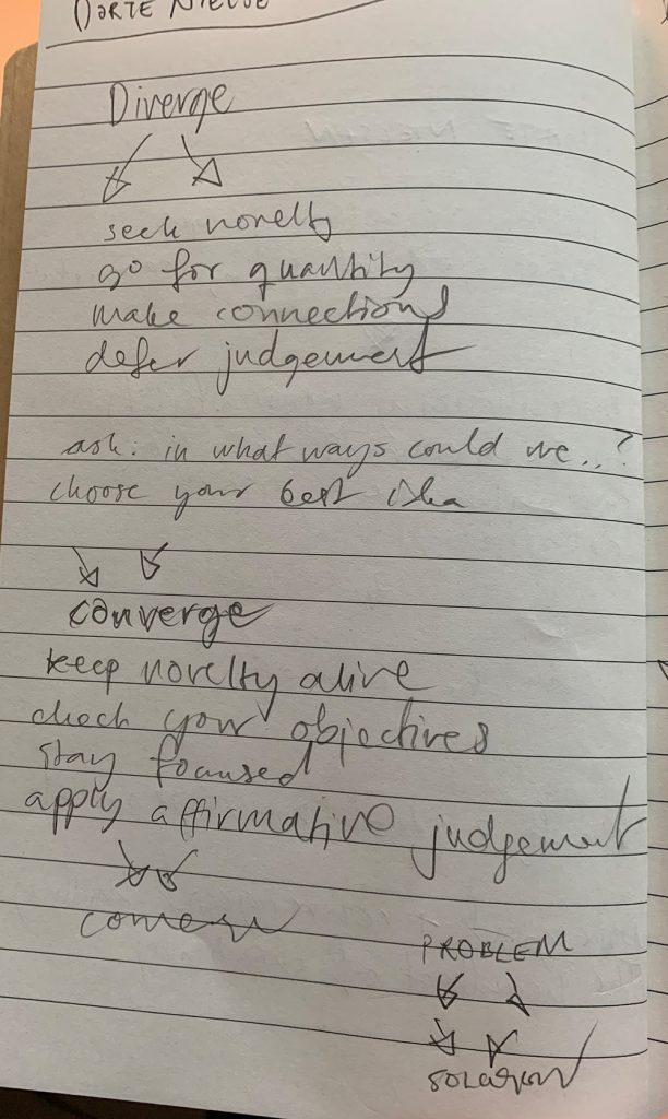
For this weeks challenge I wanted to investigate a bit on how Dorte Nielsen works with creative processes, she argues that creative people are good at seeing connections and that you can enhance ones ability to see those connections and thereby enhance your creativity. Dorte Nielsen’s work takes stance from the divergent+convergent thinking and is naming it “the heartbeat of creativity”. I decided to take on her process for solving this weeks challenge! I wanted to visualize these connections in graphic design. But also decided that the black line drawing can be a bit abstract — I don’t have to force myself into making a visual idea, but rather use the ideation as a catalyst.
Design development
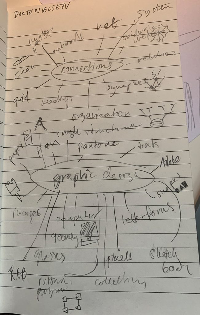
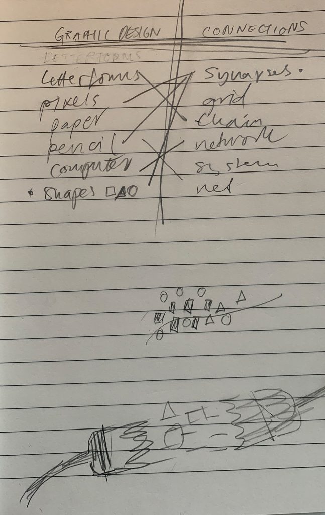
So after some mind mapping and trying out some connections from that map I got to the conclusion that I wanted to use a visual metaphor and at first I thought of using a brush as a metaphor for synapses. Synapses is something I talk about a lot, I feel like sometimes they’re working and sometimes they’re not at all there. If I am having a bad day I can say: sorry my synapses are all out today. So for me, using neurons and synapses as a foundation for my metaphor was natural. But to represent graphic design the transmitters could be the basic geometric forms: circle, triangle and square.
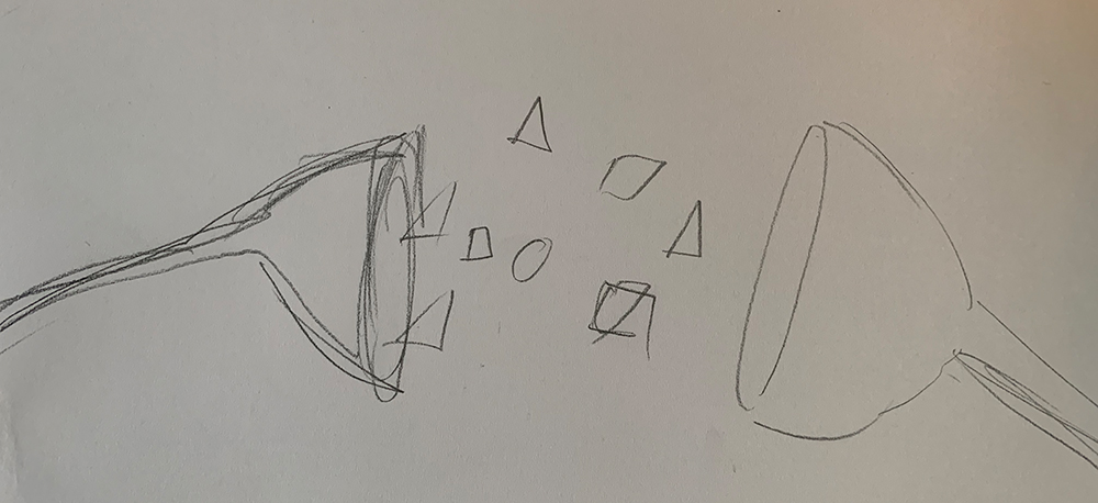
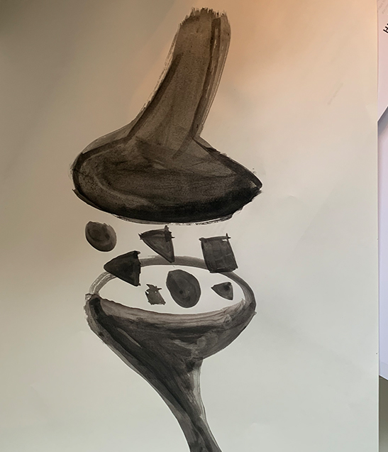
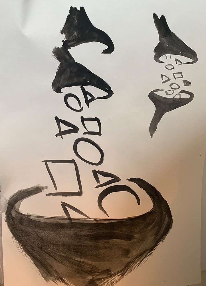
I wanted to work analoge since my interpretation of this process is that it is very organic. And as well, in the lecture it was mentioned that you should consider how you think with the tools you engage with. Analog –> allow for the imagination and imagining what something is going to look like. And designing in the computer is a much more linear process. I felt like I could not rely on my hands for this one, I had to grab a potato.
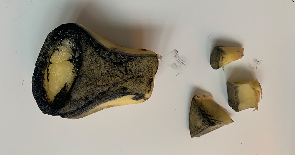
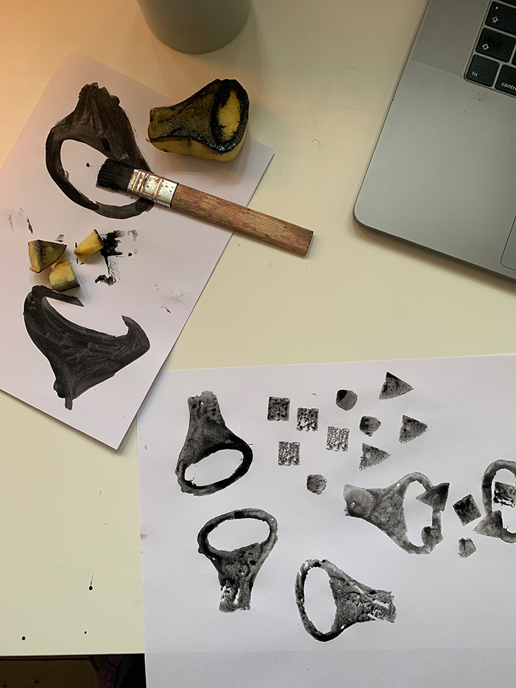
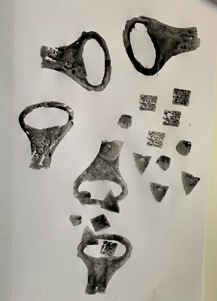
Final outcome
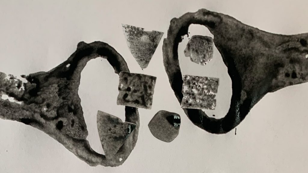
Reflection, ideas wall
The reason for this question on the ideas wall, comes from a recent controversy in Sweden on anthroposophy led pedagogy. As Rudolf Steiner had some concerning ideas on man. One of these is the ability to move, according to Steiner’s reincarnation theory, congenital handicap is basically karma from not making the right choices in the previous life. So exercising and the ability to moving the body is something that is encouraged, and something one is also categorized after in anthroposophy, creating a hierarchy.
This is the reason I reacted to the picture of the exercise in Bauhaus. Another part of the controversy when uncovering the fundamental beliefs in anthroposophy was racism. This possible connection got later further triggered after reading Escobar “As Chin unequivocally states, there are few social spaces more unrelentingly white than the art and design studio. For her this unreflective whiteness in design territories is unable to excavate the racist and sexist ideologies embedded in Bauhaus-derived aesthetics that constitute good design for many.” (Escobar)
I had to find out more about this. When searching in German, I got a very intriguing hit from Der Spiegel, but they have a solid pay wall. However, the sub-heading of that article, says:


“1919 was the year in which the Bauhaus was founded, the first Waldorf school was founded and the strange idea was born that people should be perfected. That misunderstanding still highly present today”
This is just a fundament for discussion and something that intrigued me. Could there be more connections, fundamental beliefs of problematic nature that have informed the pedagogy at Bauhaus? What does that mean for us as contemporary graphic designers? I have seen the term “Decolonise Bauhaus” but what exactly does it mean and what is underpinning that? What does Elizabeth Chin mean when talking about racist and sexist ideologies that are embedded in Bauhaus-derived aesthetics, as Escobar mentions? What does Ulrike Knöfel, author of Der Spiegel article mean by saying that the misunderstanding of the idea of and strive for the perfect man is still present today?
Final outcome feedback

I posted my outcome on the ideas wall and everyone was so positive, James even draw a parallell to Moholy-Nagy. This confused me a bit since I didn’t feel I did well at all this week. The connections are there and they are valid but the visualization… is quite far from what I usually do. Maybe that is my problem, being uncomfortable and unsure using different materials.
Shout out to Stuart and everyone else for constantly reassuring that I am in fact not misinterpreting and that I am doing fine. So kind.
References
Nielsen, Dorte and Thurber, Sara. 2019. Secret of the Highly Creative Thinker. How to Make Connections Others Don’t. BIS Publishers B.V.
Escobar, Arturo. 2018. Designs for the Pluriverse. Duke University Press.