Design development
This design required a bit more serious tone, considering the context and target audience without being too static or generic. When working with this design development, the visual research was divided into color, typography, composition and texture. I had specific ideas and aims for each of those categories.
The ambition was to find a color scale that could blow life into the material and also provide for some sublime color coding. I wanted to work with classic typography in quite a withdrawn way, but activating a few micro-typographic details to achieve some dynamic in the composition. For example using right aligned headings, mixing italics and roman, etc. The material should rely heavily on active negative space for compositional balance. The material needed some kind of texture, not too eye-catching, either something that could bring out the color–or something that was brought out by the color.
Inspiration:
Color scale
I was looking at colors from adjacent quadrants in the color wheel, in Swedish those are called “speaking colors”. They have some contrast, but are not complementary colours.
Typography
Great typography in its simplicity, slightly moved to the right, yet the text is centered. It is a serif set in both roman and italic.
This is also a composition that enjoys the negative space. Personally I like to position something in contrast to the main element as that can often create some tension in the negative space. It can also help balance the composition, especially if the typography is slightly “off”.
Textures
In the search for textures I looked at images, abstract or zoomed in, sometimes purposely distorted in print. However, texture is something I really enjoy creating myself. Usually an analog approach to the texture creates a nice tactile contrast to the rest of the elements in the composition.
Searching for a texture and a colour scale
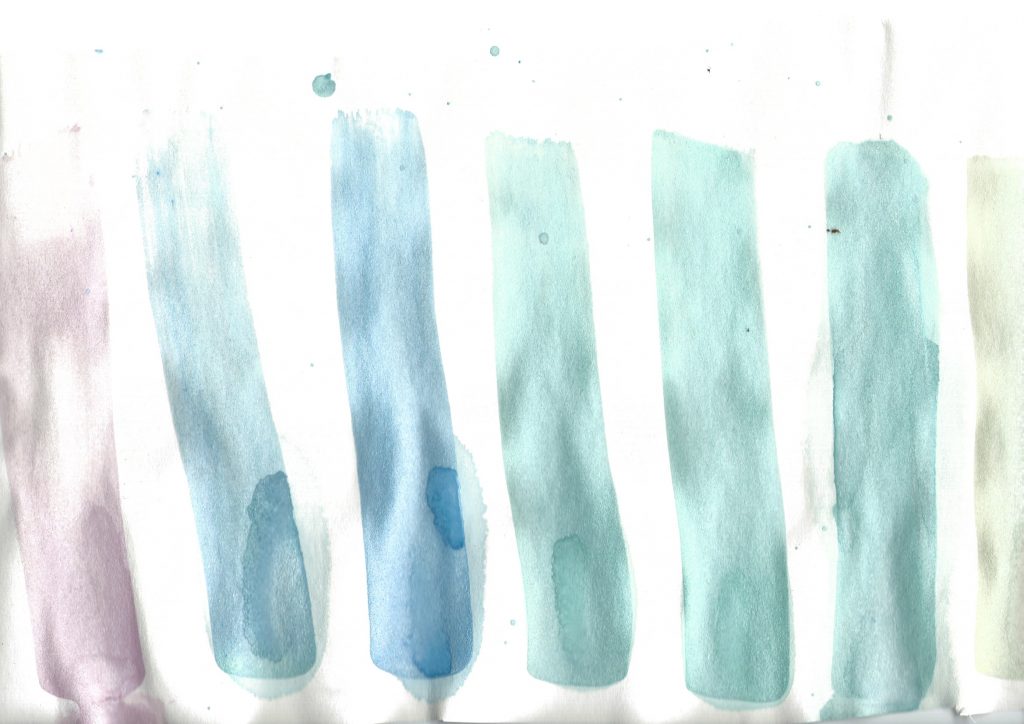
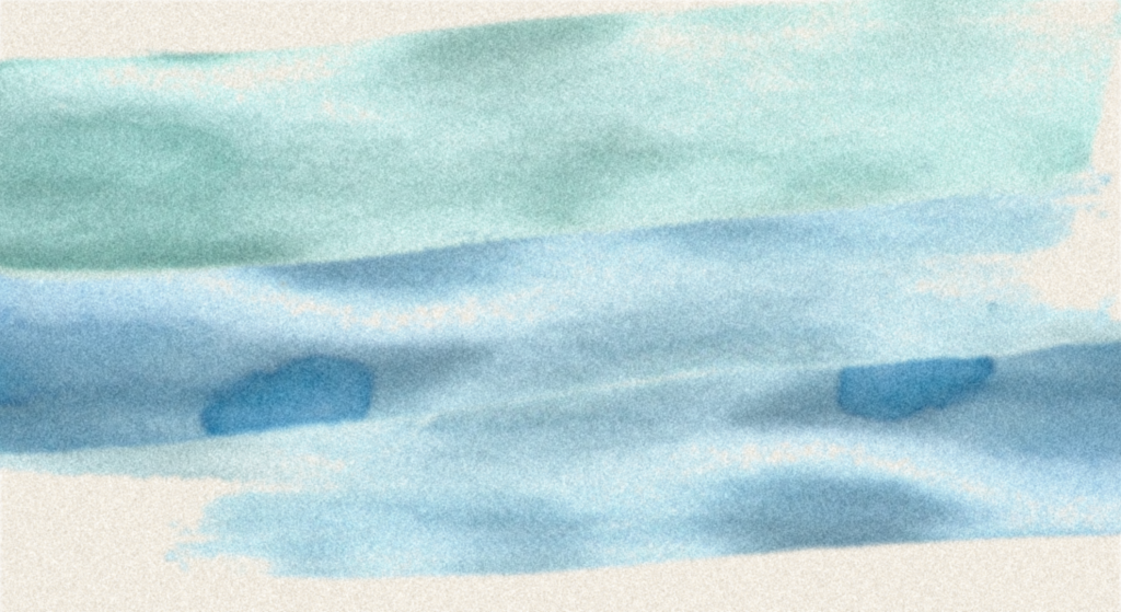
I began with some water color experiments. I wanted to see if I could use several colours for one composition. I also examined if the water colours could be a good starting point for the colour scale. Both of these experiments failed. The colours were too saturated and the texture of the watercolors did not really come through in the computer. I moved on to a more computer-generated approach:

I worked out a range of gradients and started defining the color scale through them, based on the inspiration. These gradients came out quite nice and stayed in the process for quite a while.
Name and logotype
I wanted the name of the publisher/brand to be: Ark, from the quote “The book is an ark, he says, because the noun is derived from the verb. arredrar (to frighten), and the book frightens ignorance. The book is a depository, because in the same way the ark contained things, books keep the treasures of knowledge.” (Mignolo 2003:69).
I also wanted a logo and remembered I had some left overs from a project in GDE720, some letterforms that were rejected.

These blackletter-like letters could possibly be refined into a suitable logo.

The letterforms were a bit unstable, and not really coherent.

I tightened up the lines a bit, but wanted to keep a slight feeling of them being cut out. Then I would have something with a feel of being hand-made in contrast to the detailed classic typography.
First sketches
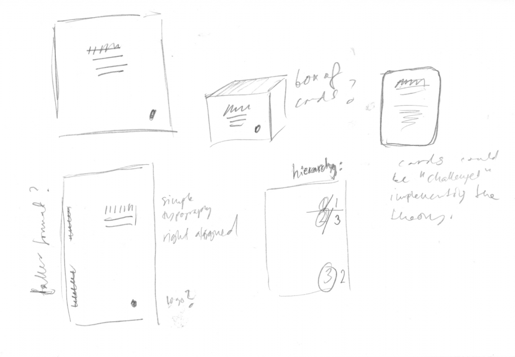
I usually do a lot of explorations in my notebooks before moving on to the computer. This is a way to structure my thoughts on the composition, format and how the objects will relate to each other.
The first sketches used the gradients and it looked ok. I sent them to a friend who is a designer and she said they looked good, she pointed out that she specifically like the typography and that the color was suitable for the context and target audience. I was however unsure of this texture, working with a gradient like this felt like an easy way out. And the expression was a bit generic, something that I explicitly wanted to avoid.
Revising sketches
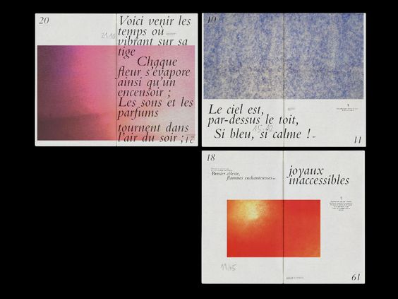
I was not satisfied with the textures and started revising the sketches. I wanted to create textures from images, through a proper halftone effect. I found a great tutorial, took the bits and pieces that I wanted to use and applied to some images I had found.
The images I chose were of oil on water, for a possibly silly nod to the perhaps impossible mission of integrating scientific and artistic research in visual communication. Or rather encourage the target audience from these respective parts to mix.
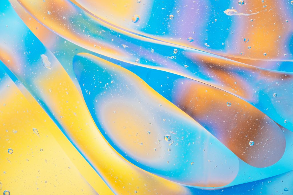
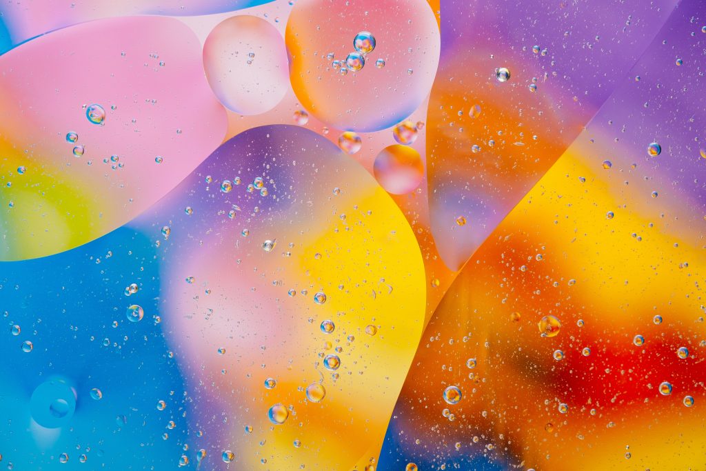


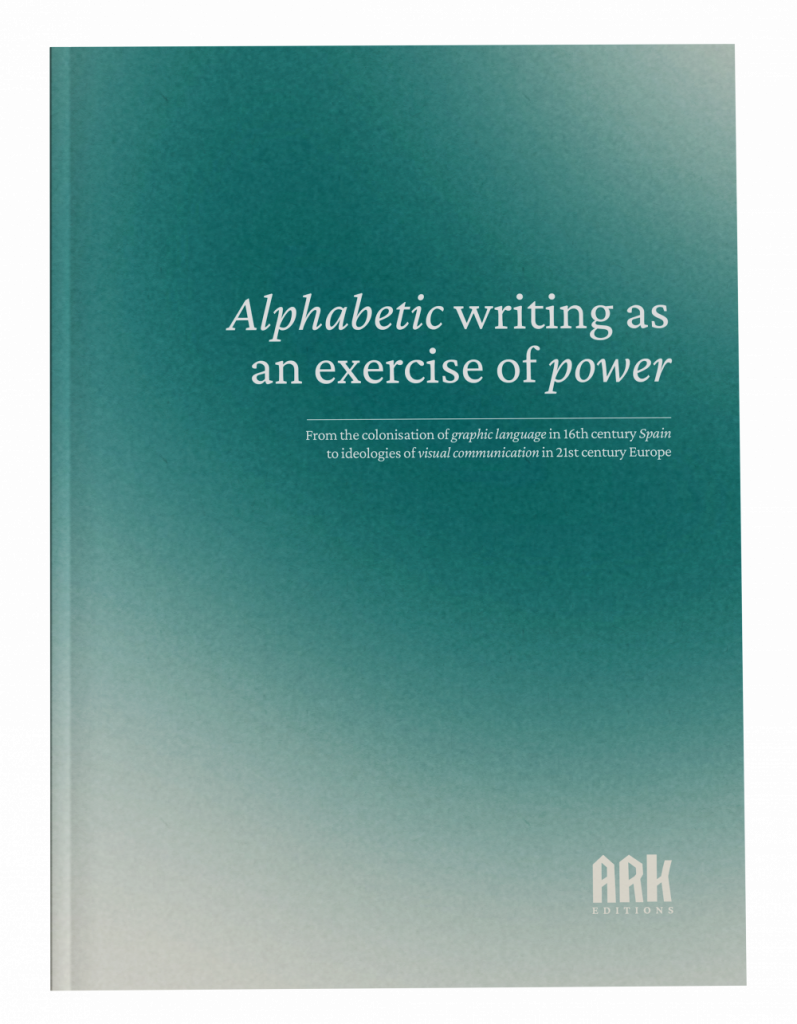
The images looked nice in halftone. But computer-made, so not much of that analog tactile texture feel I was going for. I knew I had to yet again rely on my ancient printer for the result of a project. I put the halftones in magenta as that is my printers only printable colour at the moment, printed on uncoated yellow paper to further enhance the texture.
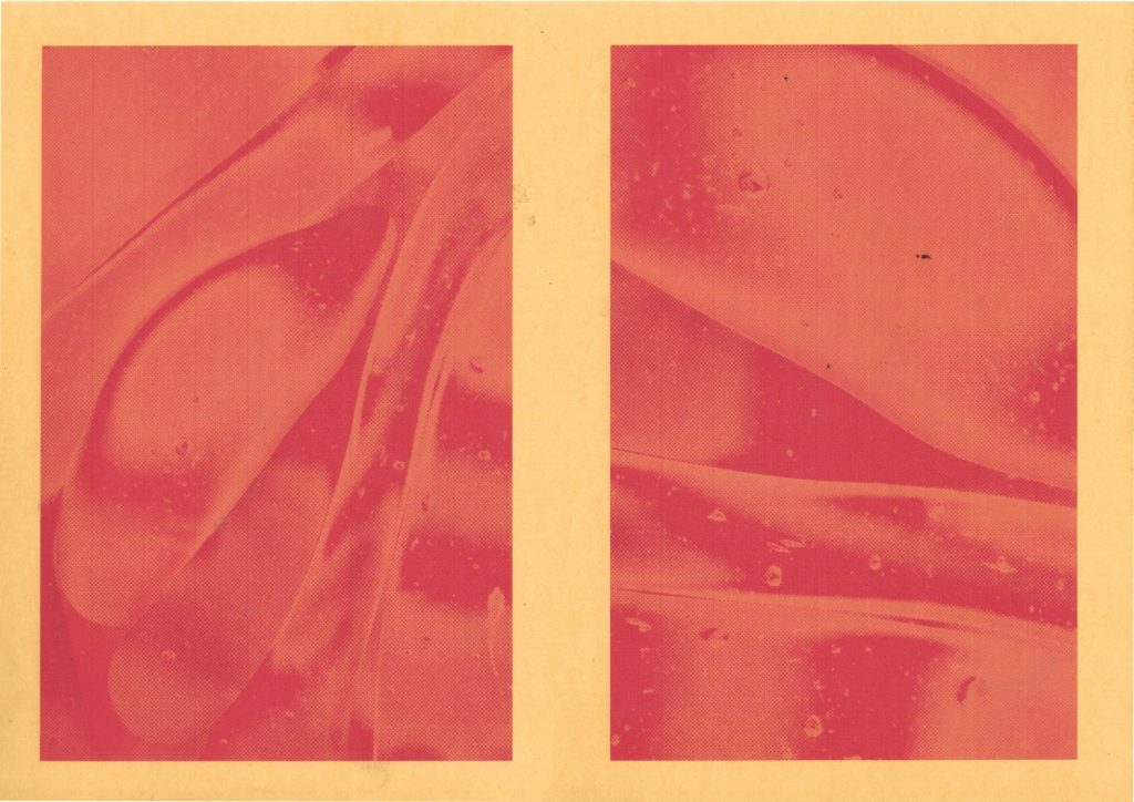
It came out great–the textures were then scanned back in and color adjusted in photoshop to suit the different themes of these booklets.
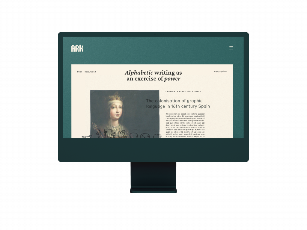
I wanted to create a website for this project, where I could show a preview of the content of the books. That content should as well echo the more tactile feel, so I printed some elements and scanned them back in.

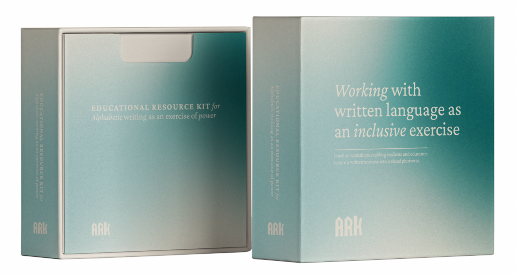
The educational resource kit was originally in a box like the one above. However, after having contact with a printers office and doing some calculations on the price. It was scrapped and replaced with a smaller booklet that could complement the bigger booklets. It was more cost effective, and it seemed more practical.
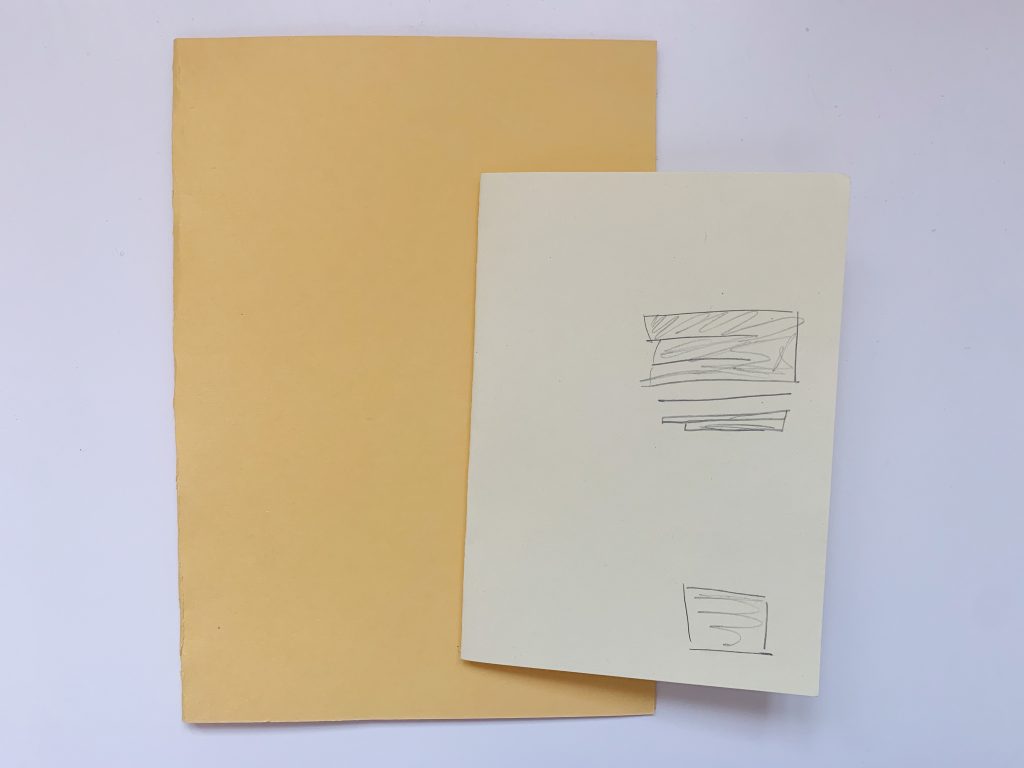
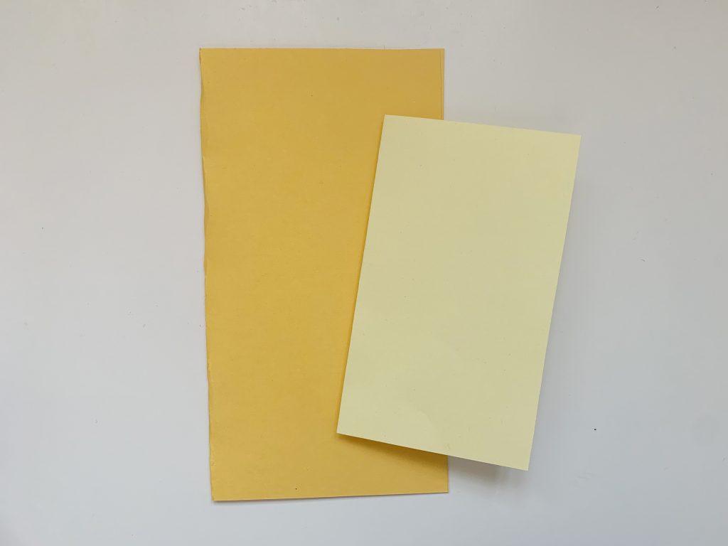
After scrapping the idea of a box I examined possible booklet formats as I wanted to better understand how the relationship between the small and big booklet would be when printed. The taller format looked really nice, but I actually went for the standard A-formats.
Final outcome

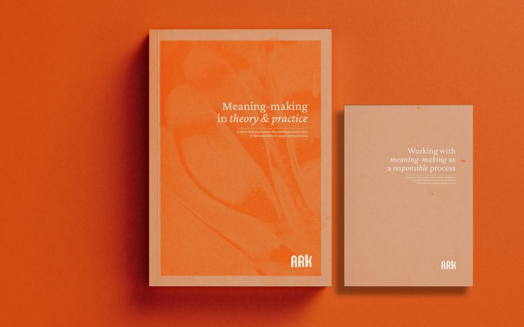
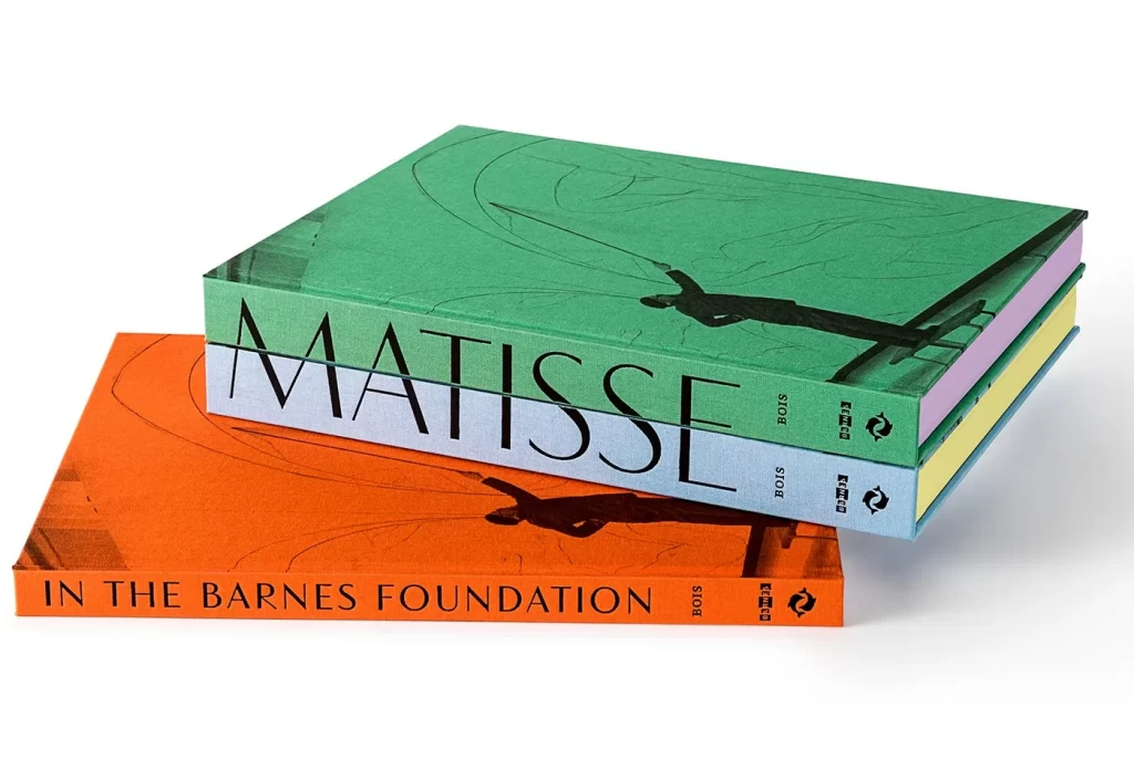
The different themes would have different colours, history would be dark green, semiotics would be orange, discourse would be light green, and yellow for methods.
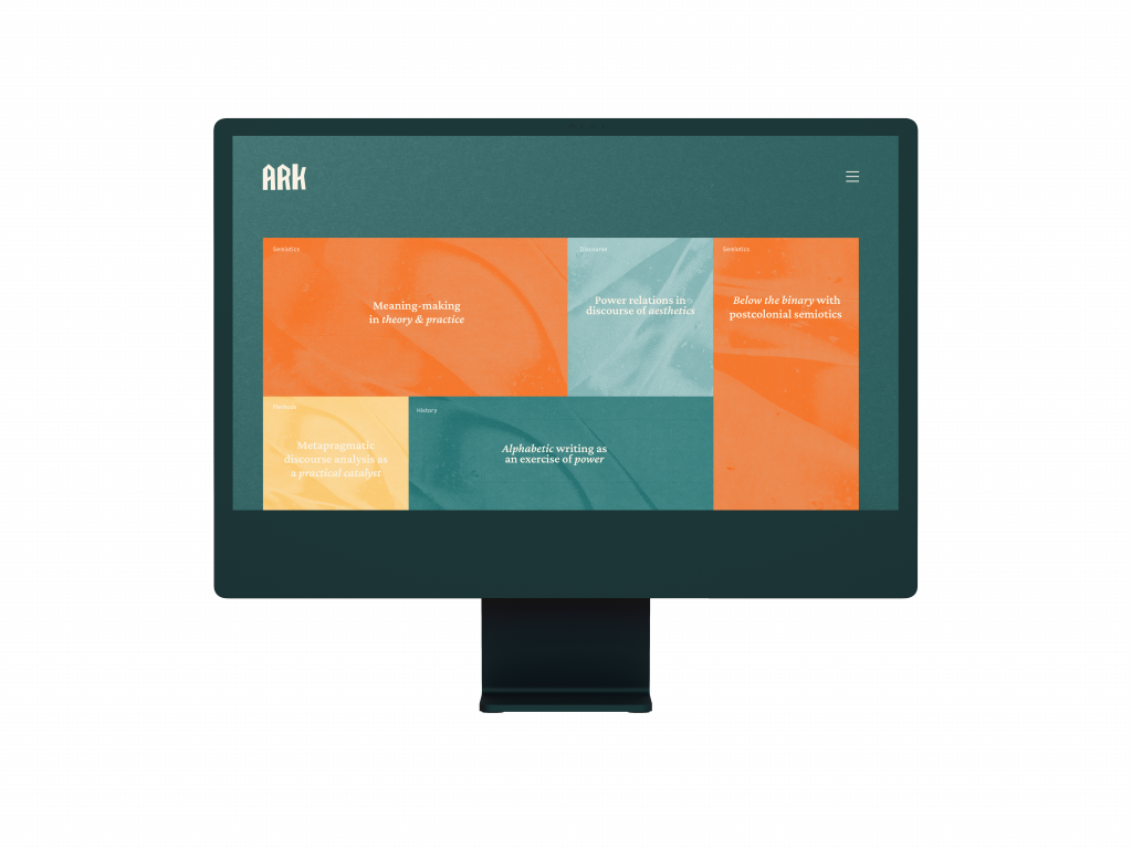
The mosaic on the start page of the webpage would display the topics of the current packs for sale. Hovering one of these would give a more detailed description and clicking one would lead to a preview of the material:
References
Mignolo, Walter. 2003. The Darker Side of the Renaissance: Literacy, Territoriality, & Colonization. The University of Michigan Press.