This week has been about preparing for the external panel review. I put a lot of effort in that since it helped me to make better sense of my project.
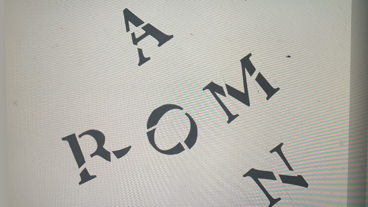
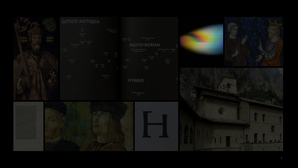
This was poorly photographed, but I printed a Jenson roman, cut it in pieces. I wanted to create a simple visualisation that contain the essence of my project. I had in mind the Pink Floyd cover for Dark Side of the Moon.
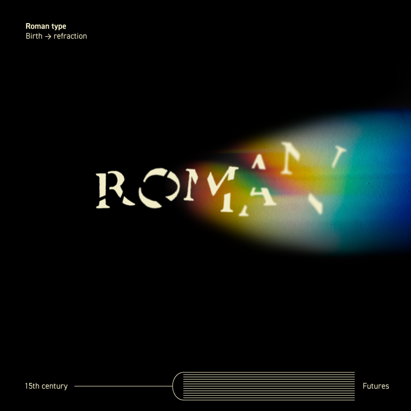
This below was really the result but when uploaded to Miro it looked a bit too detailed, so I removed the surrounding typography and just kept the ‘roman’ + refracted light.
Presentation for Miro board
One word
Refraction
One sentence
Re-thinking aesthetics of empire
One paragraph
How does roman type convey concepts deriving from ideologies of sovereignty, and what practices can enable explorations of alternate ways of visualising language?
A lot of the work for the panel review presentation this week has been incredibly valuable. For the first time in this project I feel like I know what I am doing and how I intend on doing it. I feel confident. Going for Roman type was not a given, but now that I am here it feels like the right path. I have quite a lot accumulated knowledge that I can gain from when navigating this, so it is a lot more comfortable.
I presented for my friend and colleague Lina, who is also a graphic design historian. I was terrified, because if anyone is going to see through any weaknesses of my project, it will be her. But–she was impressed. She thought the first part of my project has become really clear, the use of theory and the areas of investigation are well defined. The examples of artifacts are appropriate.
She stated that this is a complex project and coming from the outside you might need a more accessible explanation. With that in mind, I re-wrote my research questions:
Q1 How are the origins of Roman type connected to ideological constructs and how does that inflict on meaning-making processes in contemporary typography?
Q2 How can this collection enable the target audience to refract the ideological lens and explore language in a way that may raise questions about European roman type as the apex of typography and move beyond the predominant ideologies of European typography?
My project:
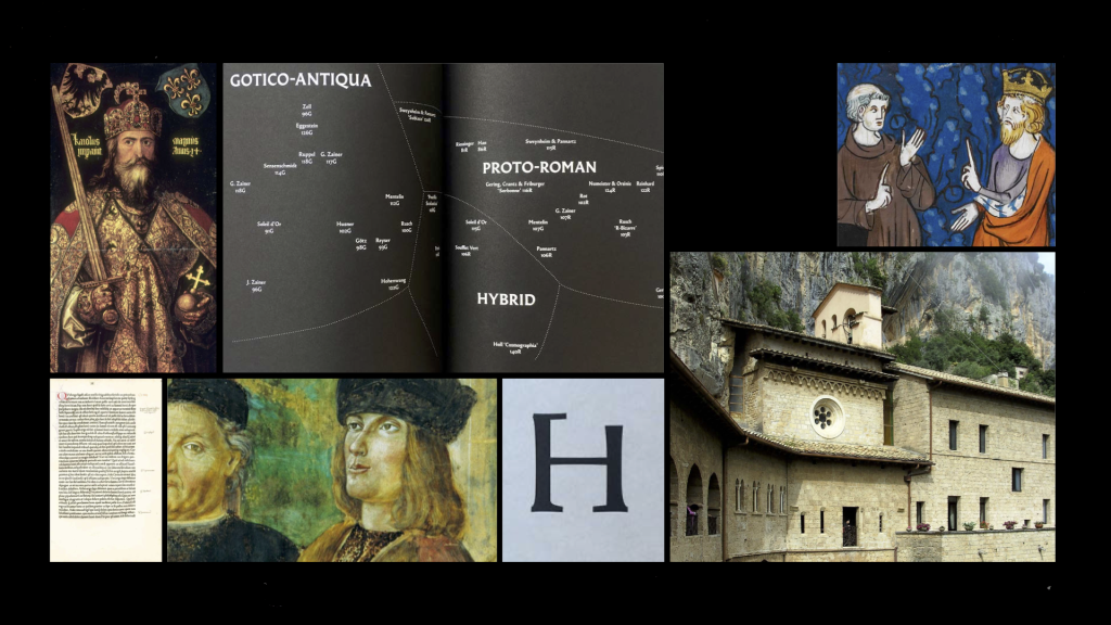
Here is a summation of my project in its current state and extracts from the presentation I held at the panel review.
My project is divided into two parts, the first part is the longer, research heavy phase. It is led by the question: How are the origins of Roman type connected to ideological constructs and how does that inflict on value in contemporary meaning-making processes in graphic design?
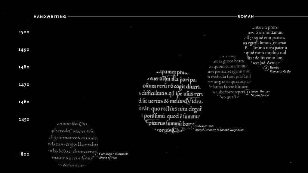
I am mapping the birth of the Roman type in Europe through case studies of type that embody ideologies from the social and cultural context of their respective time of creation.
The focus of the study is centred around the renaissance, even though an example from the middle ages is studied. Walter Mignolo states that during this period the letter was promoted to an ontological dimension. What he means is that the alphabetic letterforms became a lens through which other ways of expressing language were not only measured but also deemed inferior. Within the context of alphabetic writing, other hierarchies unfolded and during the 15th century, the still prevailing dominant roman type took form.
The analysis of ideology is fundamentally concerned with language, for language is the principal medium of meaning (signification) which serves to sustain relations of domination. (Thomson, 1984)
This project utilises and unpacks the essential building blocks of graphic design, such as language, typography, ideology and semiotics.
In this project when referring to ideologies, I am talking about Ideologies of communication, which are processes where social value is materialised. This can be described as “social” or “semiotic enregisterment”.
To be able to excavate these ideologies I will utilise a multimodal social semiotic inquiry.
A social semiotic approach to multimodal communication is sensitive to the exploration of power relations and how these are materially instantiated.
This method can hopefully be a way to create new ways of thinking about what we know. Semiotics are the atoms of communication, and social semiotics allows us to take a deeper look and is not limited to the visual representation of the object of study.
This method can help understand the social function and complexity of the objects of study. It enables focus on the connections between the people’s agency, the technologies in use, and the social context of meaning making.
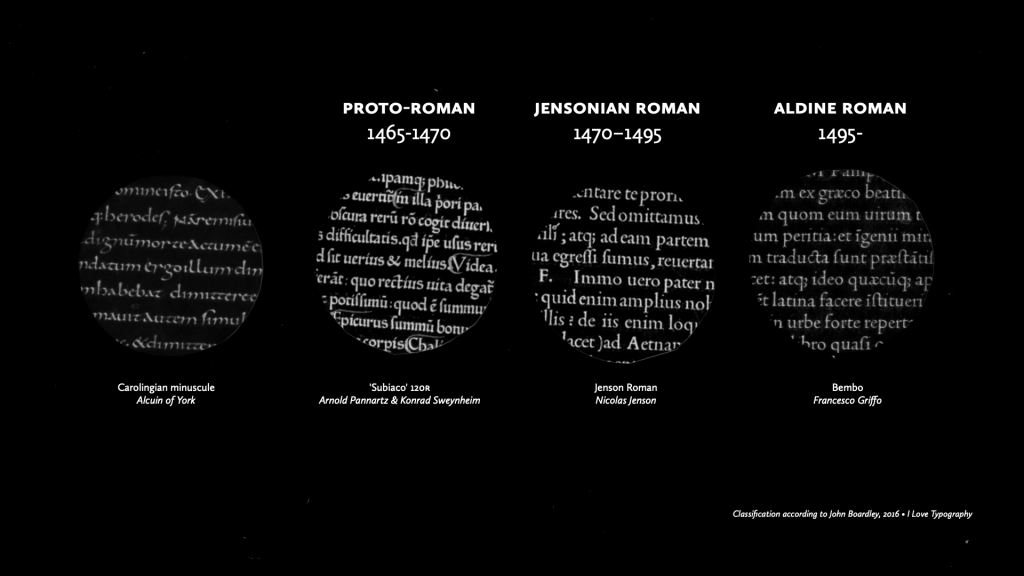
The objects of study are chosen based on the perspective of their significance to development in typography in relation to ideologies. Three of these are representative of three broader classifications of romans during the 15th century, Proto-roman, Jensonian roman and Aldine roman. However, the Carolingian minuscule is added as it plays a significant role in the construction of the Proto-roman. The Carolingian minuscule was also born from heavy ideological influence, since it was Charlemagne’s primary script in building his empire.
The first practical part of this project is to present the artefacts in a way that utilises the ideologies from the early printing period to enhance them as a unified lens.
Each object of study will be presented through a printed material. That material will contain information and written analysis along with visual representation and interpretation of the type.
This printed material will be constructed from 15th century ‘design principles’ and when it is all laid out all together, it will be like a puzzle, in which the ideological ‘lens’ is fully constructed.
In that ‘lens’ there will be a key that enables the audience to refract the existing lens.
Part II refract, This part is led by the question
How can this collection enable the target audience to
refract the ideological lens and explore language in a way that may raise questions about European roman type as the apex of typography and move beyond the predominant ideologies of European typography?
In this part I wish to examine how language could take form outside the mode of written alphabetic text. It can be sensory, oral, visual, etc.
I view this part as a smaller part of the project outcome. This is an extension meant to open up for questions rather than providing any answers.
Inspiration and thoughts on Part II
What should I consider when trying to encourage a user to explore how language can take form outside the mode of written alphabetic text?
I am looking at ‘simple’ solutions, something with a low threshold for participation. It can be something fun and digital-similar to the app Cassius released when they released their song I love you so. See video.
This is an amazing project by Éloïsa Pérez, it is called Prélettres an is a part of her doctoral research, it questions the role of typography in the pedagogy of handwriting in kindergarten. It is a device that explores the border between the drawing of letters and the construction of forms.
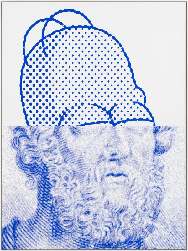
I have shown this before, but I really like this simple semiotic play. The signified here is clearly Homer, but it is two different Homers, yet both are pulled together as one sign, containing of two signifiers relating to two signifieds that share the same name. Culturally that name is of great importance, and Homer (the older…) especially in a context like this, when discussing language.
Maybe semiotic play is my thing? That would relate to my project. Because I have to consider how this extension can relate to my work done so far? I guess ideas and thoughts will come as I work on my research. I think the important part for me in the refraction part of the project will be to keep it simple.